


Product Design
Conversations App Redesign
My Contributions
I redesigned and helped launch a highly effective interface that improved patient communications and increased subscriptions. Over the two years, I worked on countless iterations that delivered in-app connections to the company’s other subscription-based products creating a sticky and seamless experience. Additionally, I partnered with developers to build a design-to-dev workflow process, leveraging Zeplin and Slack integrations, and QA’ed code directly.
Role
Senior UX Designer, Solutionreach, Inc.
2020-2023
Remote
Services
User Interviews, Surveys, Contextual Inquiries, User Stories, Feature Prioritization, User Flow, Sitemaps, Wireframes, Usability Testing, High-fidelity UI
The Challenge
The Challenge
Solutionreach, Inc. is a communications and technology company specializing in B2B software for medical, dental, and vision practices worldwide. Its portfolio of products enables practices to easily communicate with patients and manage essential tasks such as digital forms, scheduling, billing, and reviews.
A Reimagined Experience
- As a new member of the product team, I was immediately tasked with tackling a list of long-standing issues, starting with the company’s largest revenue driver, the Conversations app. The product hadn’t seen a UI update in over a decade and was struggling to meet modern user expectations.
- I was given the following directives:
- Modernize the experience – Redesign the UI with feature parity for both desktop and mobile platforms.
- Increase product stickiness – Identify opportunities for integration with other paid apps and propose new features to boost competitive value.
- Support customer-facing teams – Understand pain points from onboarding to retention by working closely with Customer Service, Account Management, and ICU teams.
- Drive data awareness – Analyze user behavior and surface meaningful metrics to guide future product decisions.
Design Audit & Research Plan
Discovery
My initial discovery process included a deep dive into legacy analytics, product walkthroughs, and interviews with internal teams.
I quickly identified core usability issues that were contributing to user frustration:
- Hidden search functionality – difficult to locate and underutilized
- Unclear folder and tab structure – poor affordance for filters and navigation
- Ambiguous patient header – no visual cues to indicate additional information was available
- Inconsistent iconography and hierarchy – non-intuitive labeling and layout
- Hidden tile information – controls only appeared on hover, reducing discoverability
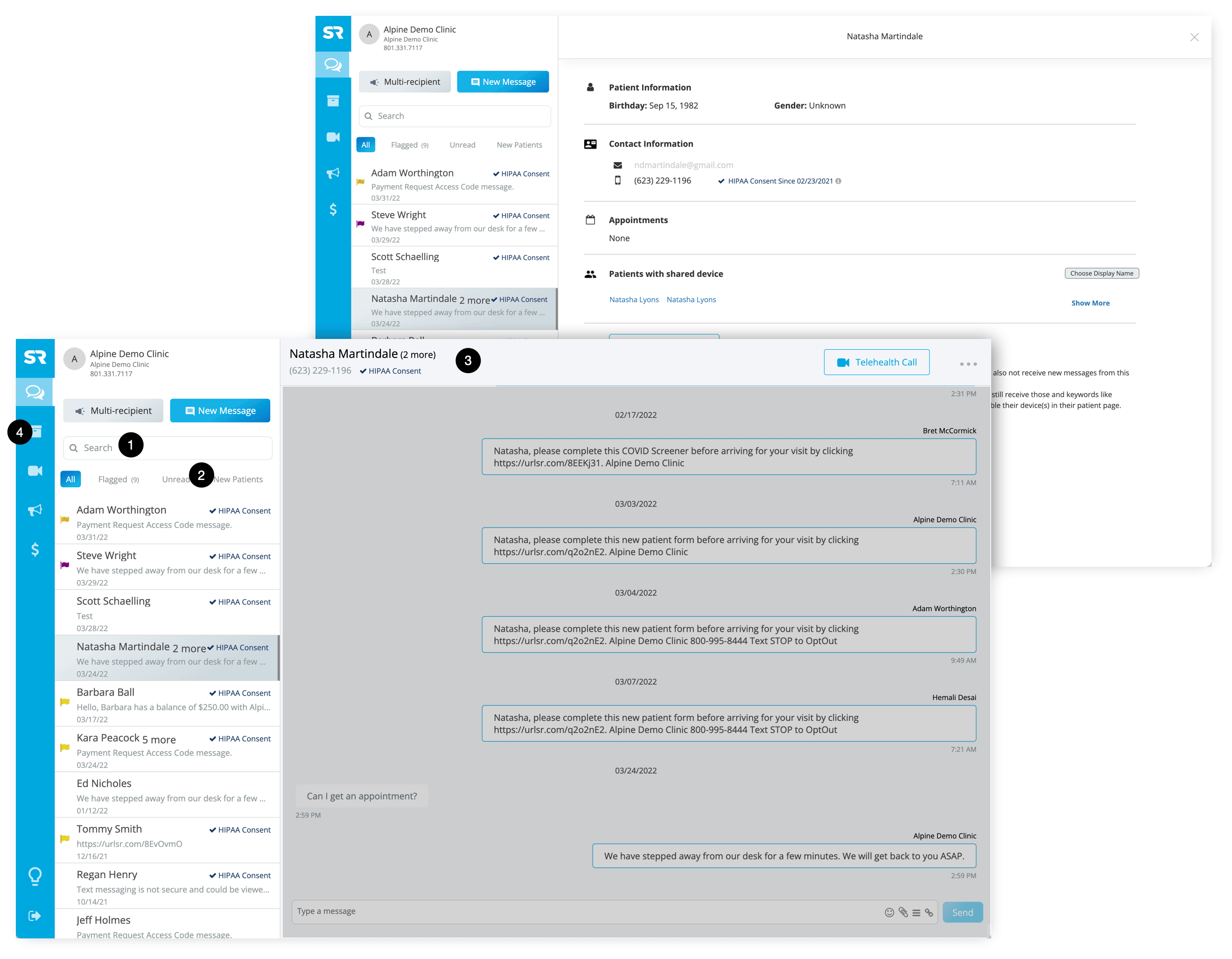
Research Plan
I developed and executed a robust research plan, relying heavily on contextual inquiries and user interviews. This approach allowed me to uncover how real users navigated the tool in their daily workflows, and where the greatest breakdowns occurred. With clear patterns emerging, I mapped out a revised sitemap and user flows to address these pain points.
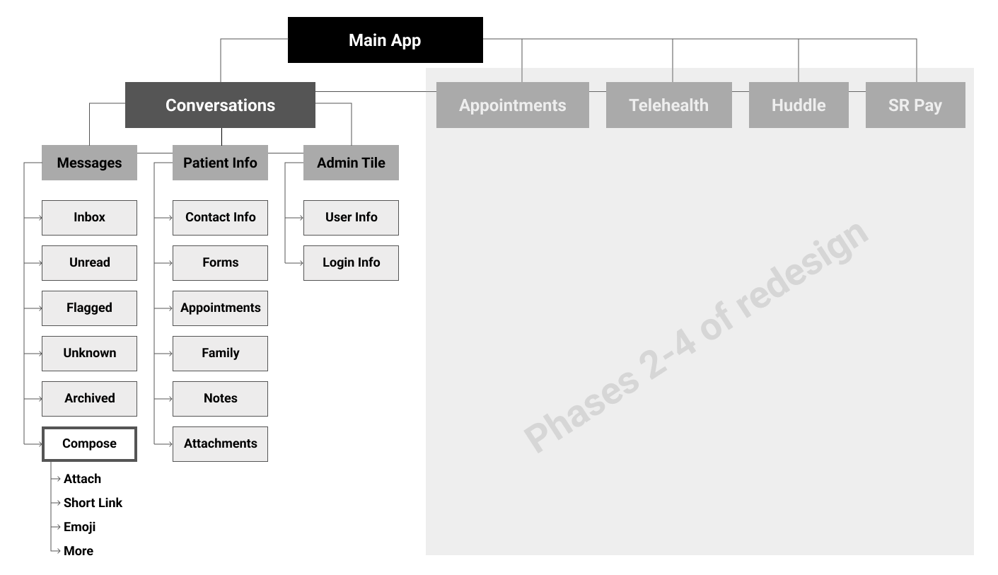
Designing the MVP
Planning the Structure
With new architecture in place, I created wireframes for several design directions—each exploring different layouts, hierarchies, and user priorities. These explorations focused on improving clarity, reducing cognitive load, and supporting natural workflows.
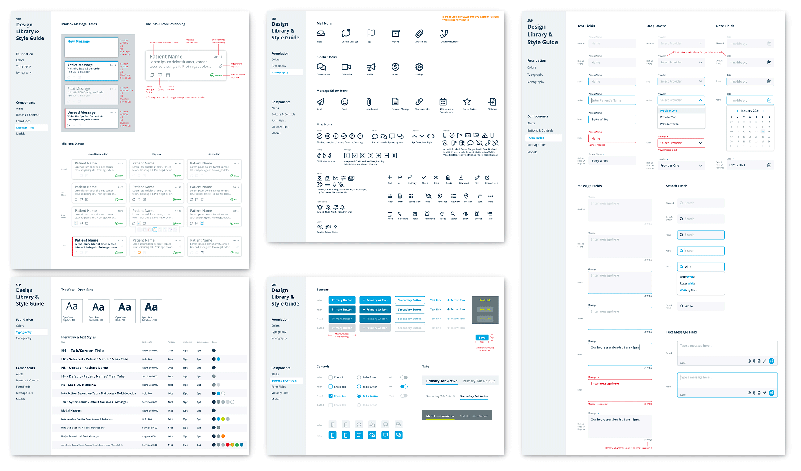
Building a Design System
Because this redesign marked the beginning of a broader UI overhaul across the entire product suite, I used this opportunity to build a scalable design system from the ground up. Key goals included:
- Establishing a shared visual language across all products with components based on common web conventions and validated through user testing
- Ensuring consistency and scalability by identifying patterns that could cascade across future screens and features
- Developing thorough documentation to support both designer and developer adoption across teams
For an in-depth look at the SR Design System, click here.
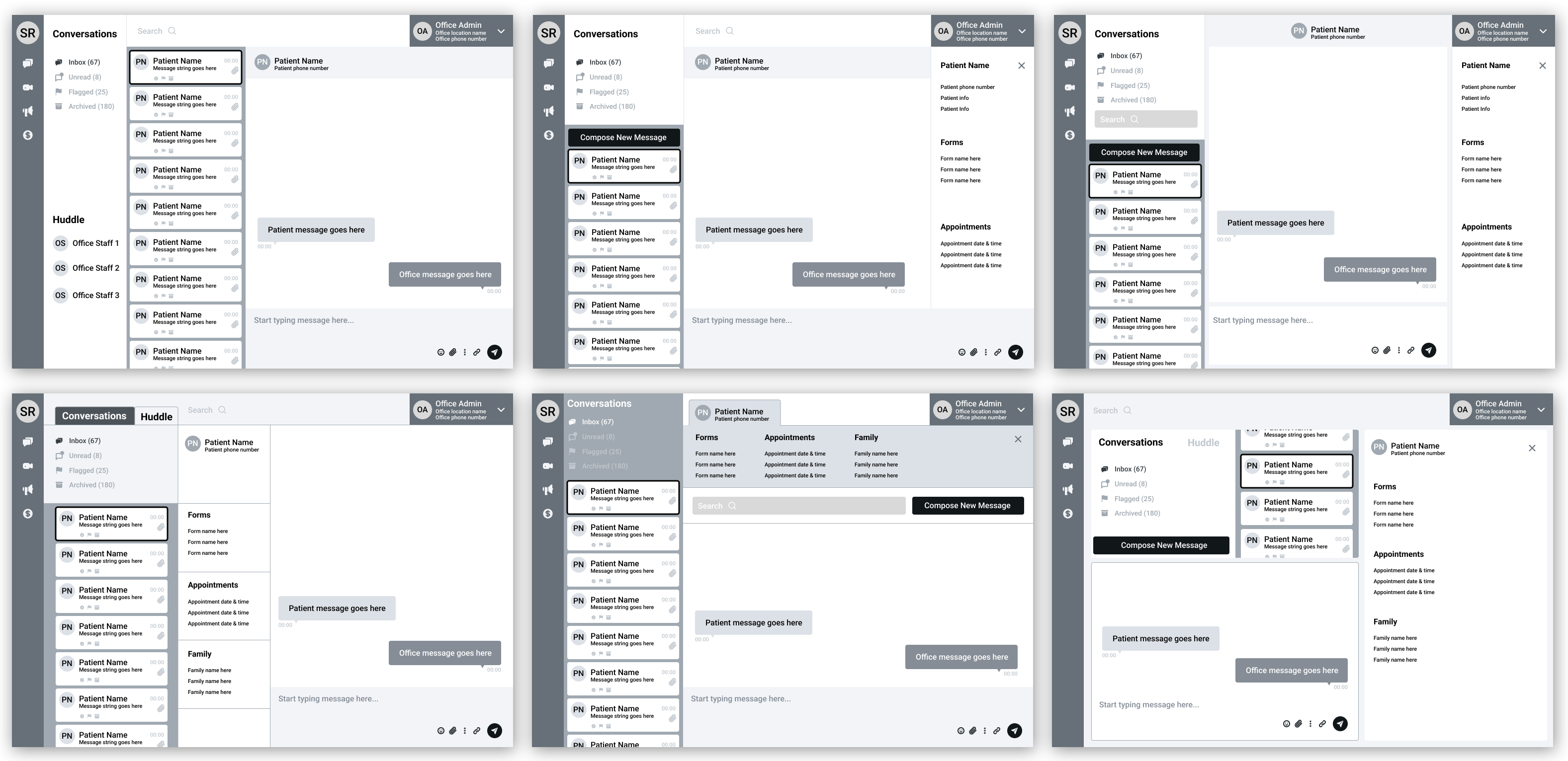
Design & Ideate
With the design system taking shape, I moved into mid-fidelity mockups and prototypes. I tested these with 25 users sourced through in-app surveys, interviews with super users, and feedback from customer service teams. This iterative testing informed refinements and ensured that functionality and usability were on target.
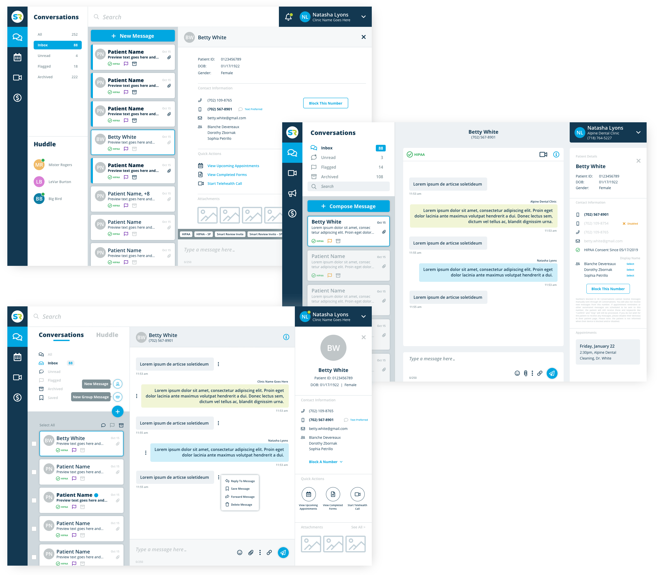
Following validation of the MVP experience, I finalized the design system and created a developer handoff process that ensured accurate implementation and allowed for ongoing iteration.
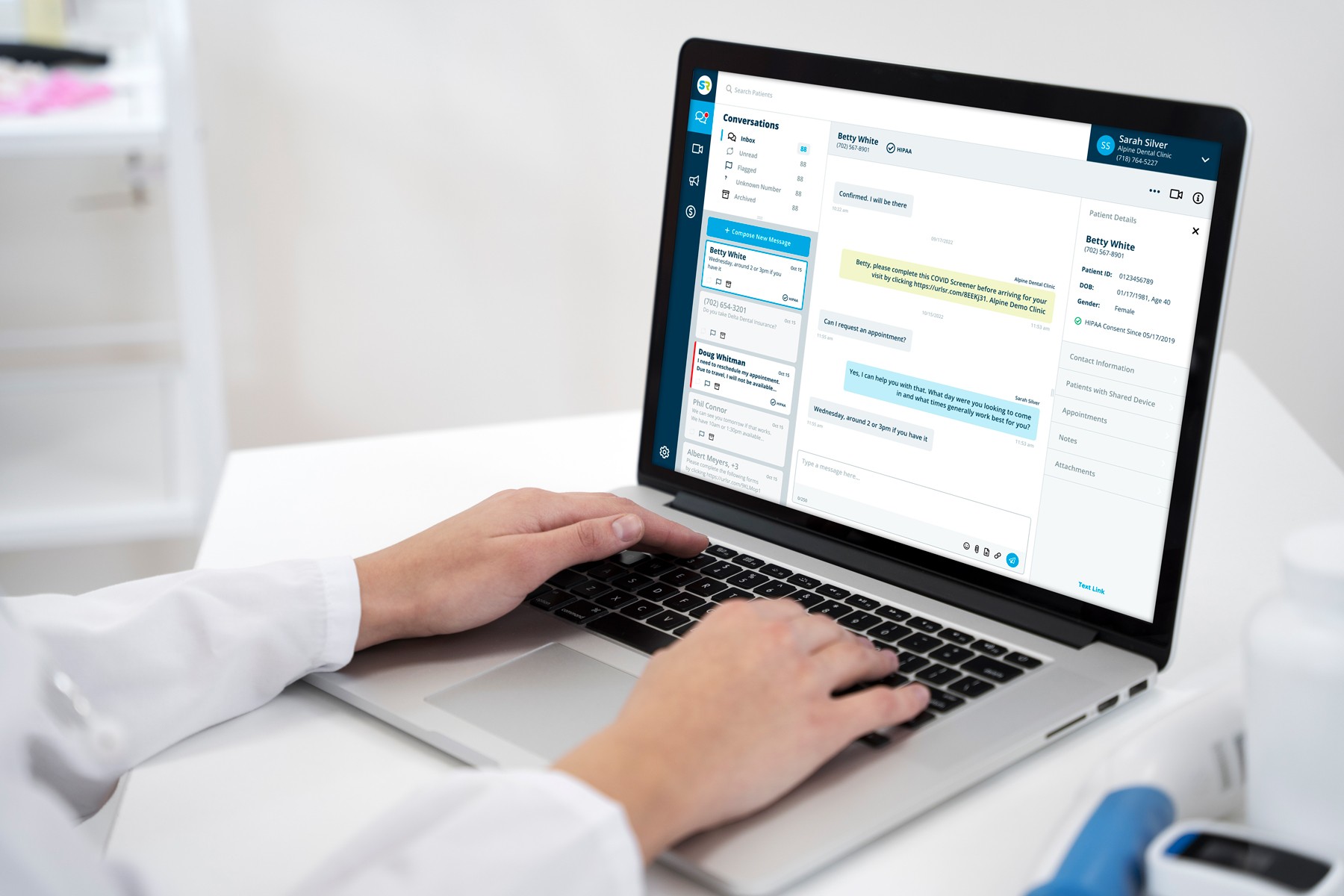
The Solution
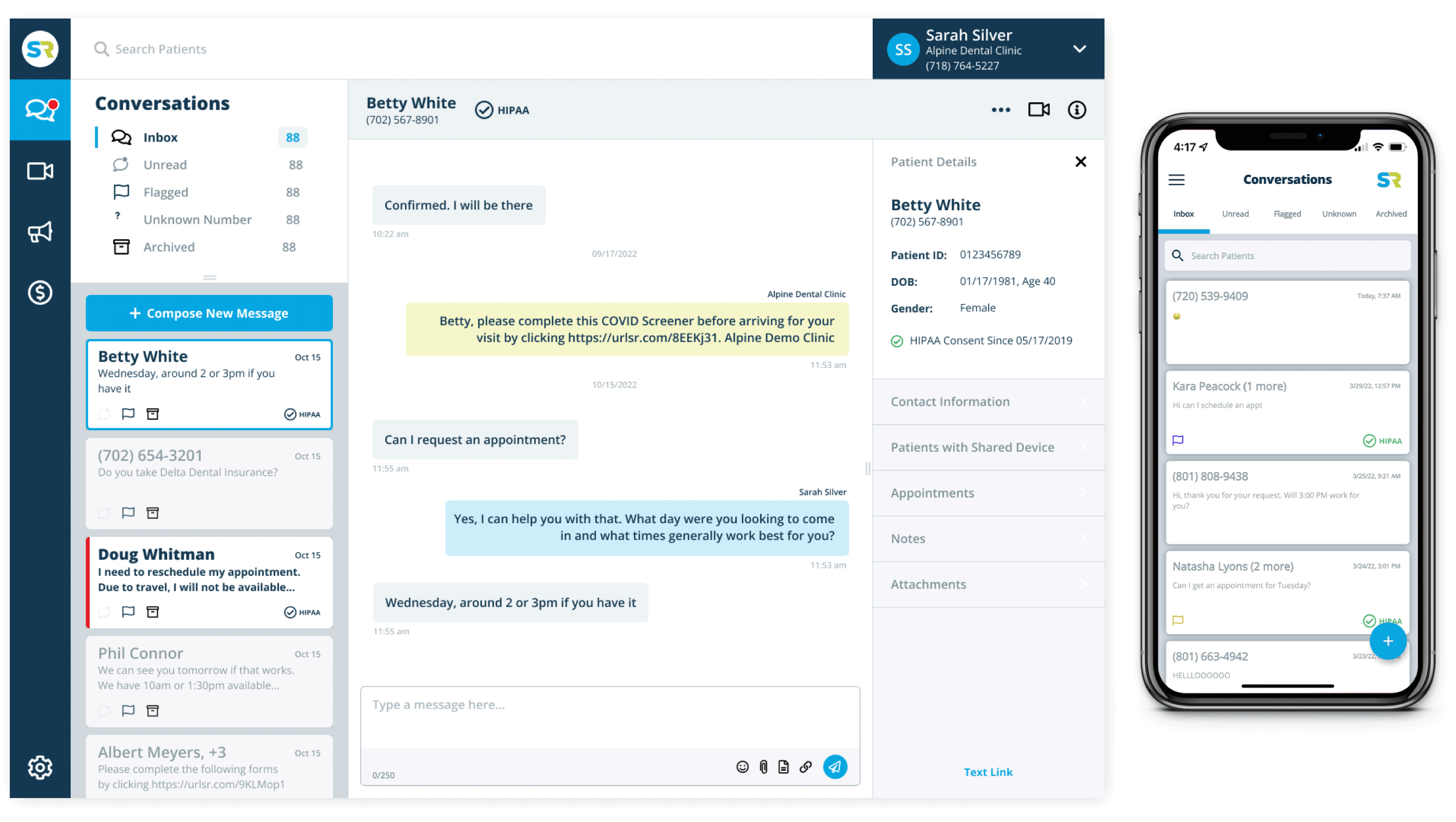
After six months of research, design, and development, we launched the redesigned Conversations app for both desktop and mobile platforms. Within three months of release, we saw:
- A 23% reduction in Customer Service call volume
- A 18% increase in product subscriptions
- Over 400 new customers signed across all Solutionreach offerings
Customer satisfaction feedback highlighted a “more intuitive interface” and improved ease of use for managing patient communications and related services.
Future Improvements
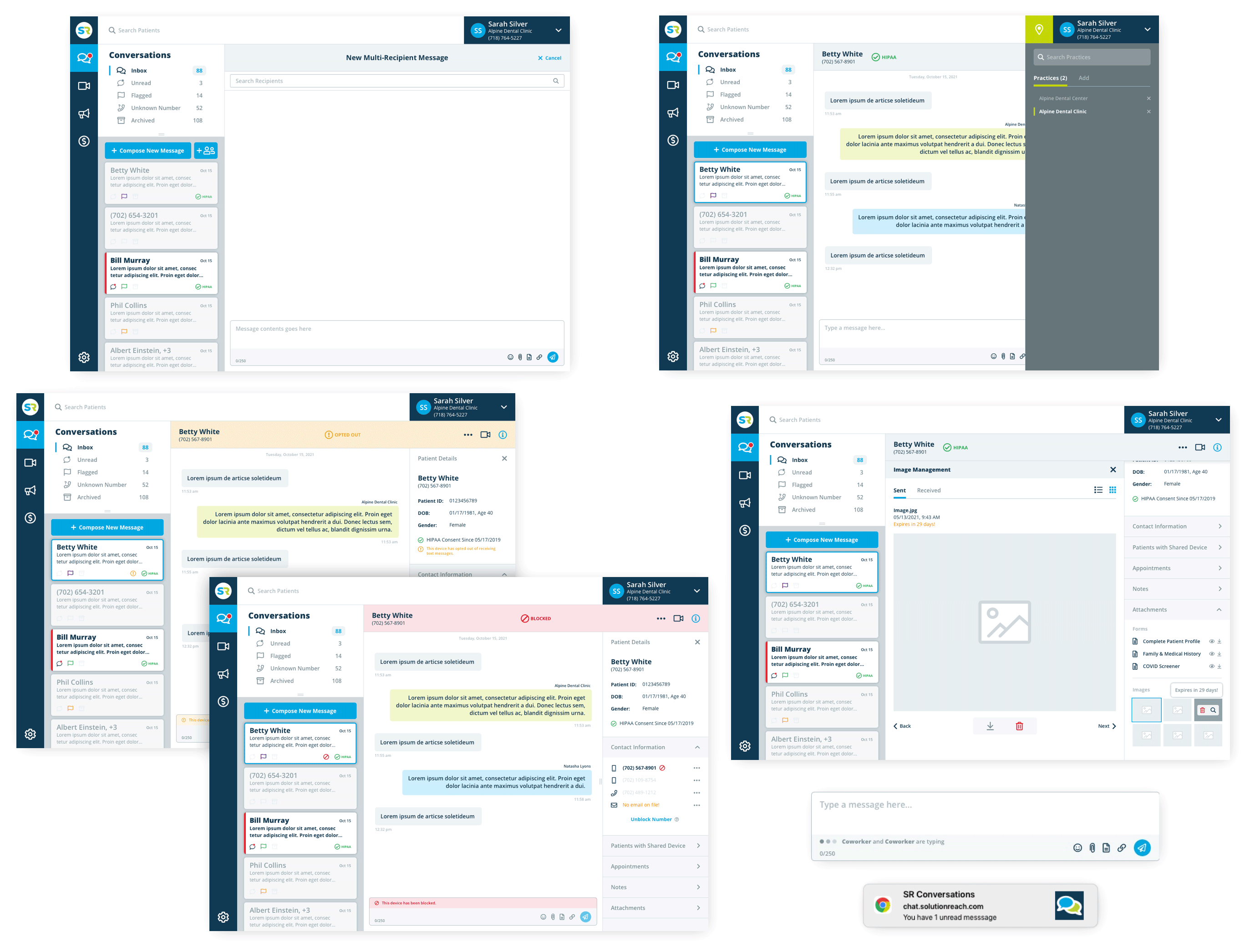
Following the success of the Conversations app, I continued to lead design updates across the rest of the product ecosystem using the same research-driven, system-led approach. Over the next two years, I expanded the Conversations feature set and helped transform the entire product suite into a modern experience and positioned Solutionreach for continued growth and innovation.
Product Design
Conversations App Redesign
My Contributions
I redesigned and helped launch a highly effective interface that improved patient communications and increased subscriptions. Over the two years, I worked on countless iterations that delivered in-app connections to the company’s other subscription-based products creating a sticky and seamless experience. Additionally, I partnered with developers to build a design-to-dev workflow process, leveraging Zeplin and Slack integrations, and QA’ed code directly.
Role
Senior UX Designer, Solutionreach, Inc.
2020-2023
Remote
Services
User Interviews, Surveys, Contextual Inquiries, User Stories, Feature Prioritization, User Flow, Sitemaps, Wireframes, Usability Testing, High-fidelity UI
The Challenge
The Challenge
Solutionreach, Inc. is a communications and technology company specializing in B2B software for medical, dental, and vision practices worldwide. Its portfolio of products enables practices to easily communicate with patients and manage essential tasks such as digital forms, scheduling, billing, and reviews.
A Reimagined Experience
- As a new member of the product team, I was immediately tasked with tackling a list of long-standing issues, starting with the company’s largest revenue driver, the Conversations app. The product hadn’t seen a UI update in over a decade and was struggling to meet modern user expectations.
- I was given the following directives:
- Modernize the experience – Redesign the UI with feature parity for both desktop and mobile platforms.
- Increase product stickiness – Identify opportunities for integration with other paid apps and propose new features to boost competitive value.
- Support customer-facing teams – Understand pain points from onboarding to retention by working closely with Customer Service, Account Management, and ICU teams.
- Drive data awareness – Analyze user behavior and surface meaningful metrics to guide future product decisions.
Design Audit & Research Plan
Discovery
My initial discovery process included a deep dive into legacy analytics, product walkthroughs, and interviews with internal teams.
I quickly identified core usability issues that were contributing to user frustration:
- Hidden search functionality – difficult to locate and underutilized
- Unclear folder and tab structure – poor affordance for filters and navigation
- Ambiguous patient header – no visual cues to indicate additional information was available
- Inconsistent iconography and hierarchy – non-intuitive labeling and layout
- Hidden tile information – controls only appeared on hover, reducing discoverability
Research Plan
I developed and executed a robust research plan, relying heavily on contextual inquiries and user interviews. This approach allowed me to uncover how real users navigated the tool in their daily workflows, and where the greatest breakdowns occurred. With clear patterns emerging, I mapped out a revised sitemap and user flows to address these pain points.
Designing the MVP
Planning the Structure
With new architecture in place, I created wireframes for several design directions—each exploring different layouts, hierarchies, and user priorities. These explorations focused on improving clarity, reducing cognitive load, and supporting natural workflows.
Building a Design System
Because this redesign marked the beginning of a broader UI overhaul across the entire product suite, I used this opportunity to build a scalable design system from the ground up. Key goals included:
- Establishing a shared visual language across all products with components based on common web conventions and validated through user testing
- Ensuring consistency and scalability by identifying patterns that could cascade across future screens and features
- Developing thorough documentation to support both designer and developer adoption across teams
For an in-depth look at the SR Design System, click here.
Design & Ideate
With the design system taking shape, I moved into mid-fidelity mockups and prototypes. I tested these with 25 users sourced through in-app surveys, interviews with super users, and feedback from customer service teams. This iterative testing informed refinements and ensured that functionality and usability were on target.
Following validation of the MVP experience, I finalized the design system and created a developer handoff process that ensured accurate implementation and allowed for ongoing iteration.
The Solution
After six months of research, design, and development, we launched the redesigned Conversations app for both desktop and mobile platforms. Within three months of release, we saw:
- A 23% reduction in Customer Service call volume
- A 18% increase in product subscriptions
- Over 400 new customers signed across all Solutionreach offerings
Customer satisfaction feedback highlighted a “more intuitive interface” and improved ease of use for managing patient communications and related services.
Future Improvements
Following the success of the Conversations app, I continued to lead design updates across the rest of the product ecosystem using the same research-driven, system-led approach. Over the next two years, I expanded the Conversations feature set and helped transform the entire product suite into a modern experience and positioned Solutionreach for continued growth and innovation.
Product Design
Conversations App Redesign
My Contributions
I redesigned and helped launch a highly effective interface that improved patient communications and increased subscriptions. Over the two years, I worked on countless iterations that delivered in-app connections to the company’s other subscription-based products creating a sticky and seamless experience. Additionally, I partnered with developers to build a design-to-dev workflow process, leveraging Zeplin and Slack integrations, and QA’ed code directly.
Role
Senior UX Designer, Solutionreach, Inc.
2020-2023
Remote
Services
User Interviews, Surveys, Contextual Inquiries, User Stories, Feature Prioritization, User Flow, Sitemaps, Wireframes, Usability Testing, High-fidelity UI
The Challenge
The Challenge
Solutionreach, Inc. is a communications and technology company specializing in B2B software for medical, dental, and vision practices worldwide. Its portfolio of products enables practices to easily communicate with patients and manage essential tasks such as digital forms, scheduling, billing, and reviews.
A Reimagined Experience
As a new member of the product team, I was immediately tasked with tackling a list of long-standing issues, starting with the company’s largest revenue driver, the Conversations app. The product hadn’t seen a UI update in over a decade and was struggling to meet modern user expectations.
I was given the following directives:
- Modernize the experience – Redesign the UI with feature parity for both desktop and mobile platforms.
- Increase product stickiness – Identify opportunities for integration with other paid apps and propose new features to boost competitive value.
- Support customer-facing teams – Understand pain points from onboarding to retention by working closely with Customer Service, Account Management, and ICU teams.
- Drive data awareness – Analyze user behavior and surface meaningful metrics to guide future product decisions.
Design Audit & Research Plan
Discovery
My initial discovery process included a deep dive into legacy analytics, product walkthroughs, and interviews with internal teams.
I quickly identified core usability issues that were contributing to user frustration:
- Hidden search functionality – difficult to locate and underutilized
- Unclear folder and tab structure – poor affordance for filters and navigation
- Ambiguous patient header – no visual cues to indicate additional information was available
- Inconsistent iconography and hierarchy – non-intuitive labeling and layout
- Hidden tile information – controls only appeared on hover, reducing discoverability
Research Plan
I developed and executed a robust research plan, relying heavily on contextual inquiries and user interviews. This approach allowed me to uncover how real users navigated the tool in their daily workflows, and where the greatest breakdowns occurred. With clear patterns emerging, I mapped out a revised sitemap and user flows to address these pain points.
Designing the MVP
Planning the Structure
With new architecture in place, I created wireframes for several design directions—each exploring different layouts, hierarchies, and user priorities. These explorations focused on improving clarity, reducing cognitive load, and supporting natural workflows.
Building a Design System
Because this redesign marked the beginning of a broader UI overhaul across the entire product suite, I used this opportunity to build a scalable design system from the ground up. Key goals included:
- Establishing a shared visual language across all products with components based on common web conventions and validated through user testing
- Ensuring consistency and scalability by identifying patterns that could cascade across future screens and features
- Developing thorough documentation to support both designer and developer adoption across teams
For an in-depth look at the SR Design System, click here.
Design & Ideate
With the design system taking shape, I moved into mid-fidelity mockups and prototypes. I tested these with 25 users sourced through in-app surveys, interviews with super users, and feedback from customer service teams. This iterative testing informed refinements and ensured that functionality and usability were on target.
Following validation of the MVP experience, I finalized the design system and created a developer handoff process that ensured accurate implementation and allowed for ongoing iteration.
The Solution
After six months of research, design, and development, we launched the redesigned Conversations app for both desktop and mobile platforms. Within three months of release, we saw:
- A 23% reduction in Customer Service call volume
- A 18% increase in product subscriptions
- Over 400 new customers signed across all Solutionreach offerings
Customer satisfaction feedback highlighted a “more intuitive interface” and improved ease of use for managing patient communications and related services.
Future Improvements
Following the success of the Conversations app, I continued to lead design updates across the rest of the product ecosystem using the same research-driven, system-led approach. Over the next two years, I expanded the Conversations feature set and helped transform the entire product suite into a modern experience and positioned Solutionreach for continued growth and innovation.