


Design Systems
SR Design System
My Contributions
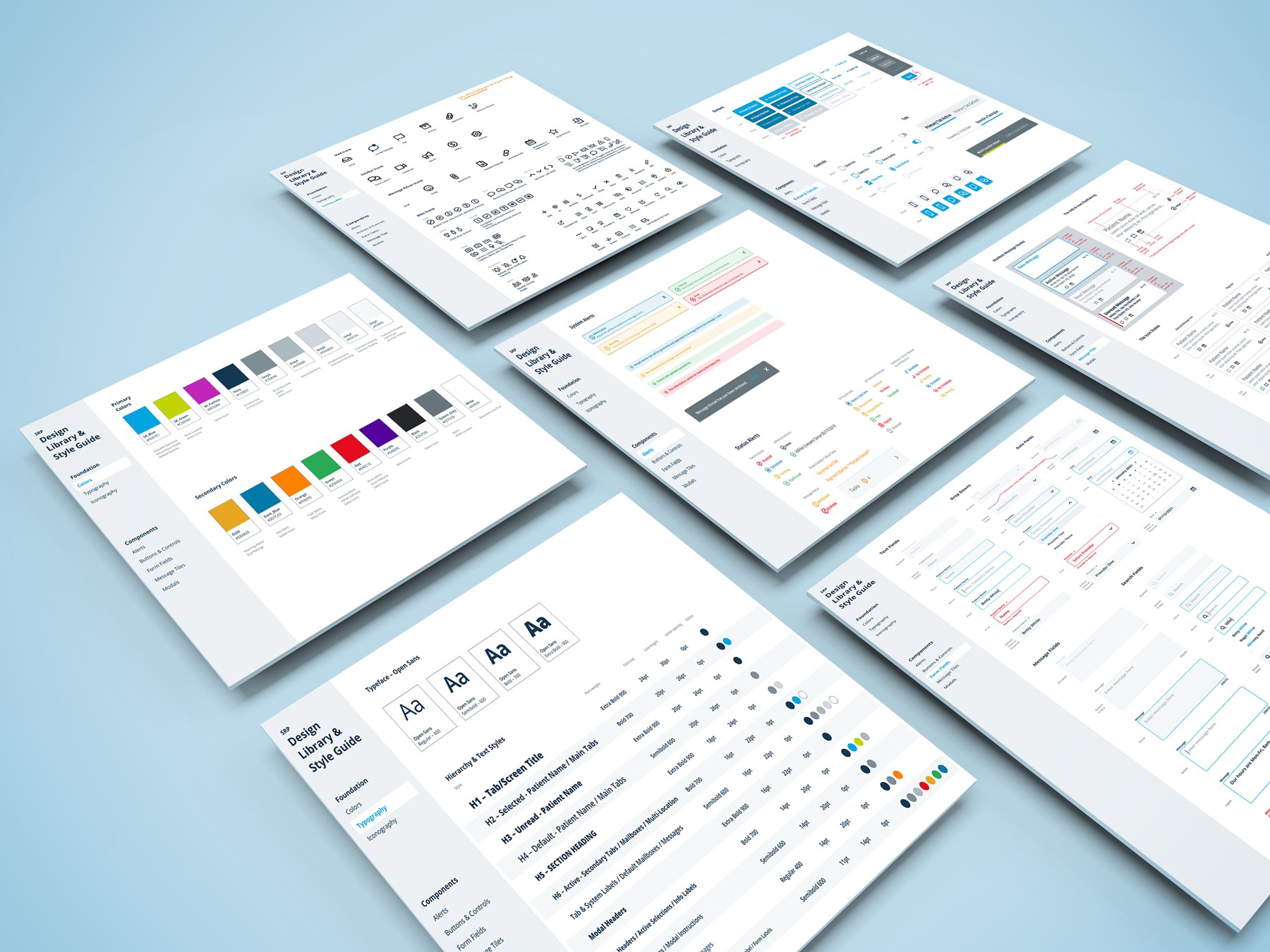
I led the creation of the SR Design System, defining its foundation, visual language, and reusable components. My work included establishing spacing standards, typography hierarchy, an accessible color system, and an extensive icon library validating patterns through customer and stakeholder testing. The resulting system enabled faster product development, consistent user experiences, and smoother adoption across design and engineering teams.
Role
Senior UX Designer, Solutionreach, Inc.
2020-2023
Remote
Services
Component library, Documentation, Styleguide
The Challenge
About Solutionreach
Solutionreach, Inc. is a communications and technology company specializing in B2B software for medical, dental, and vision practices worldwide. Its portfolio of products enables practices to easily communicate with patients and manage essential tasks such as digital forms, scheduling, billing, and reviews.
Vetted and Valuable Reusable Components
The need for a scalable design system was first identified during the Conversations App Redesign. However, its value quickly became clear for the entire product suite, all of which were scheduled for redesign. Creating the Solutionreach (SR) Design System required not just a strong visual and interaction framework but also validation and buy-in from both customers and internal teams.
- Validating through user-testing with input from customers, sales teams, and support staff
- Establishing a shared visual language across all products with components based on common web conventions
- Ensuring consistency and scalability by identifying patterns that could cascade across future screens and features
- Developing thorough documentation to support both designer and developer adoption across teams
Execution
Foundation
The SR product portfolio was designed primarily for front-desk staff in medical and dental offices. While a companion mobile app existed, the desktop experience was the primary focus and not intended to scale responsively across all devices. After auditing customer hardware and equipment, it was determined that traditional responsive scaling wasn’t a requirement. Instead, I established an 8px grid and defined consistent spacing units to provide clarity and rhythm across components.
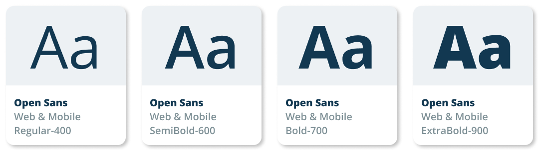
Typography
I implemented the Open Sans font family, creating a flexible type scale that covered current and future product needs. Varying weights helped define hierarchy, including titles, sections, and states, and ensured consistency across applications.
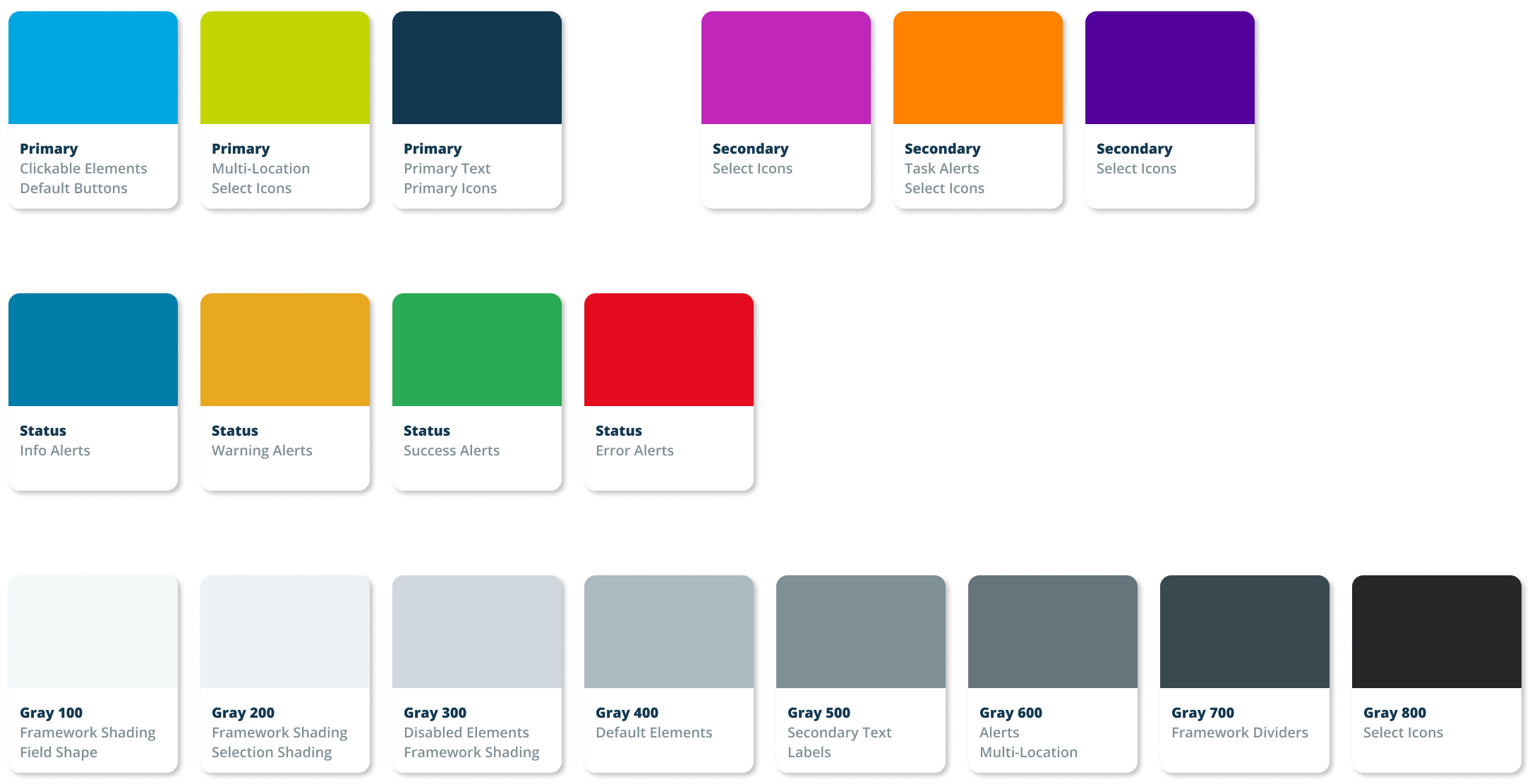
Color Palette
Solutionreach already had a modern palette aligned with its medical and dental audience. I refined select values for accessibility, then expanded the system with status colors and a broader grayscale to support interactive states and utilities.
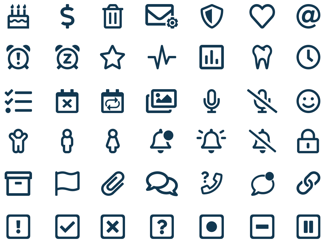
Iconography
Icons played a critical role in navigation and quick actions, often tested heavily during the Conversations App project. While some placements didn’t allow for labels, all icons included coded tooltips for clarity. Leveraging Font Awesome alongside custom SR-specific icons, I built a comprehensive icon library that balanced familiarity with brand-specific needs.
Buttons & Controls
User testing revealed strong expectations for standard interaction patterns. To meet these, I designed an intuitive set of buttons, icon-buttons, links, and tabs that aligned with common web conventions. These patterns became widely adopted after usability validation.
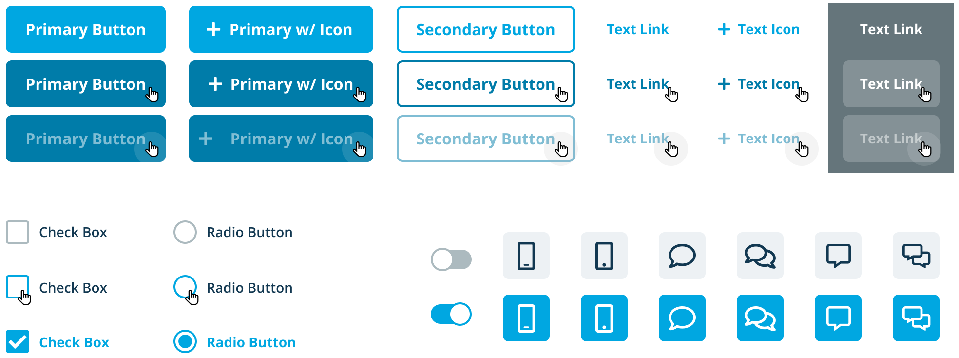
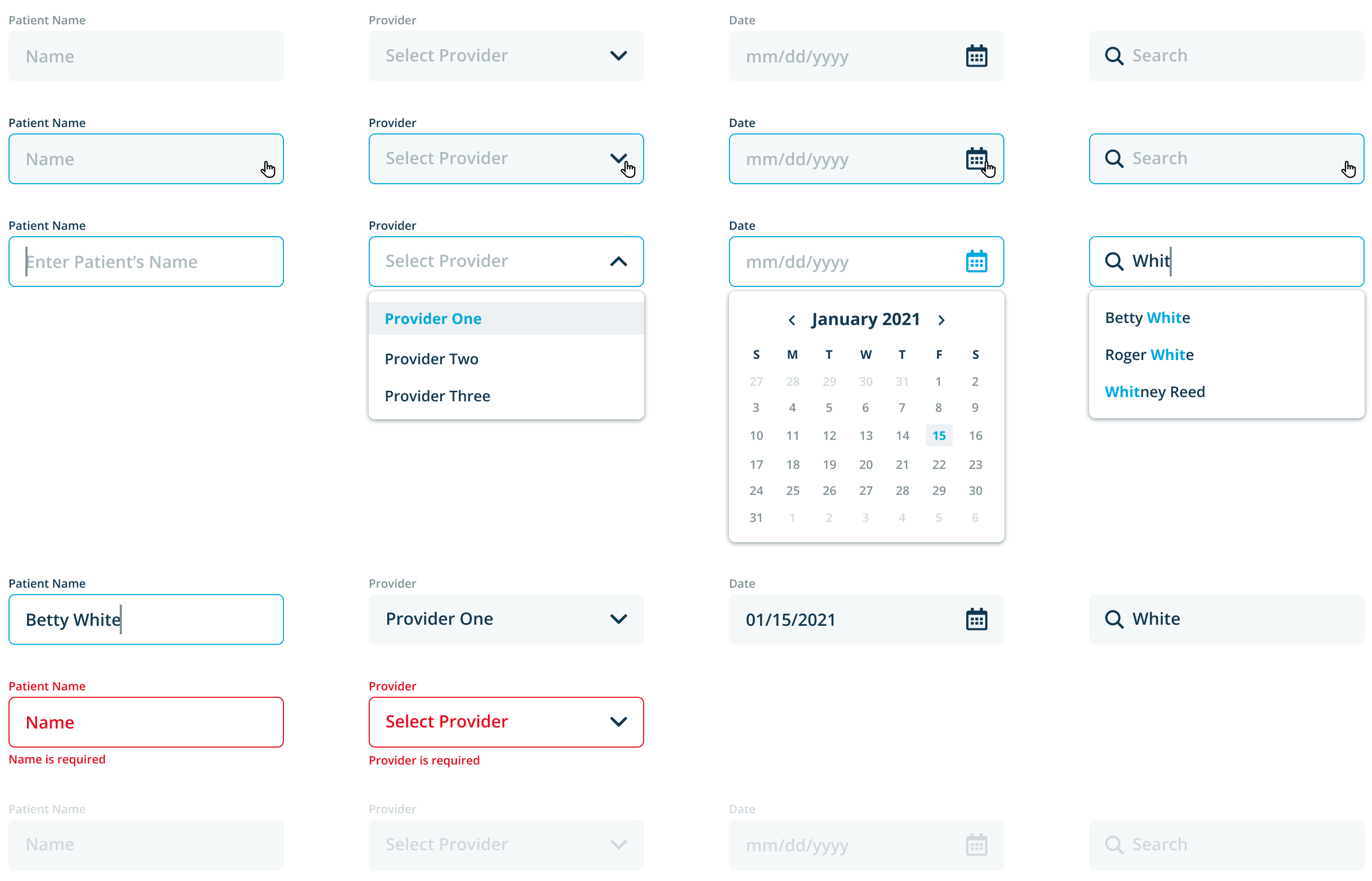
Form Fields
Beyond standard input patterns, SR required custom variants and extended search input rules to accommodate its unique workflows.
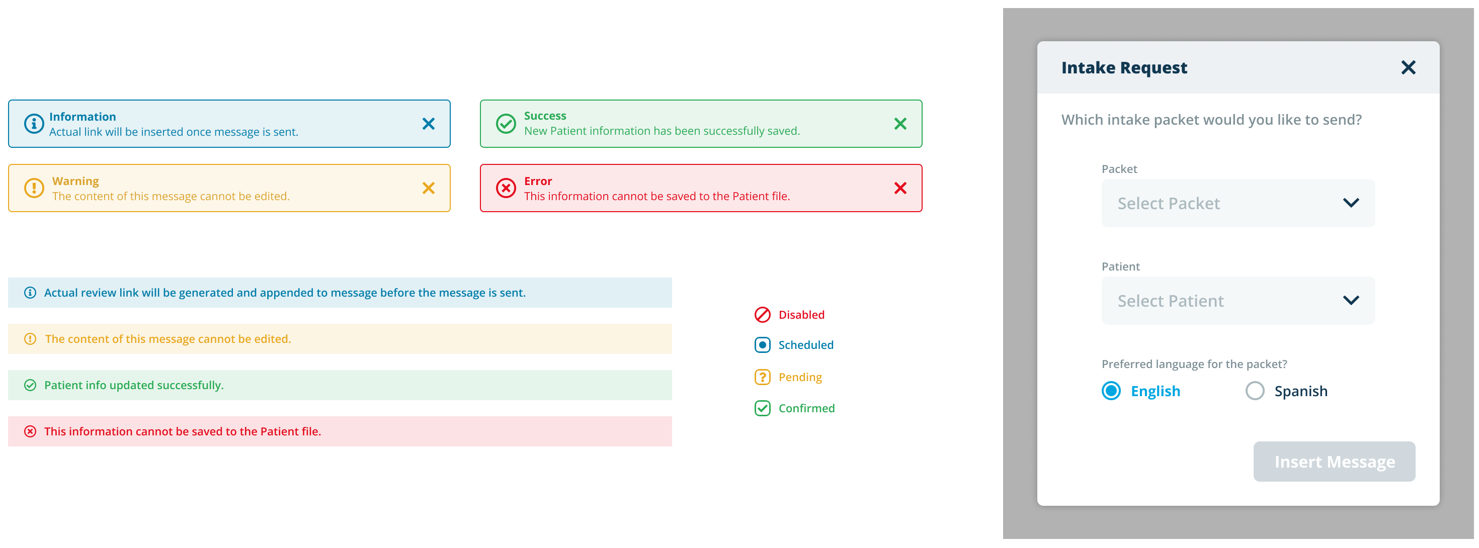
Alerts & Modals
Statuses and system messages were vital for office staff, often informing direct patient communication. I designed a robust system of alerts and modals to handle diverse scenarios consistently across products.
Additional Components
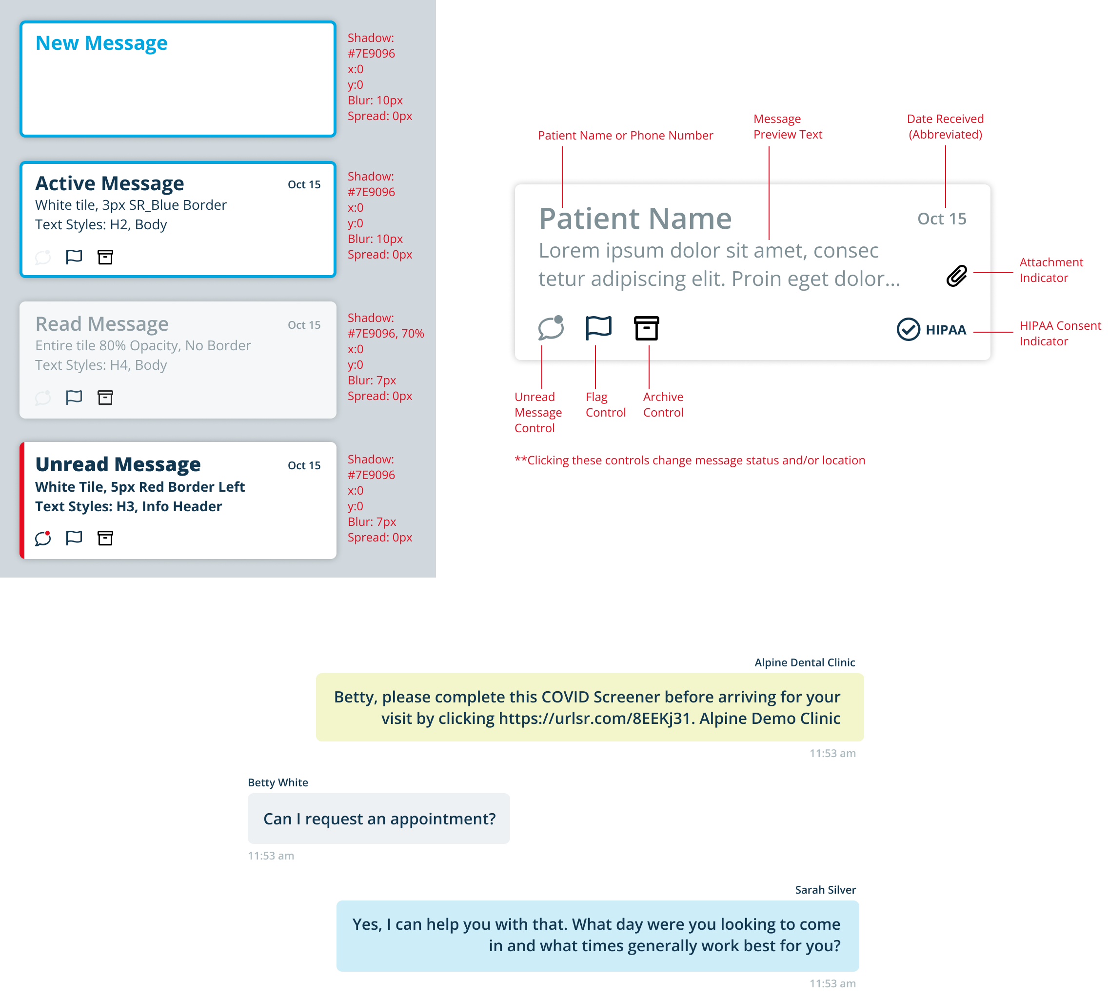
Messaging was central to the Conversations experience, requiring deeply researched message tiles and chat bubbles. Tiles included multiple statuses and indicators for quick filtering, while chat bubbles distinguished between patients, practices, and staff.
The Solution
The SR Design System provided a scalable, customer-approved foundation for the company’s growing portfolio. Designers could now reskin existing products, accelerate new feature development, and maintain competitive advantage—all while reducing usability testing time and improving customer satisfaction.

Design Systems
SR Design System
My Contributions
I led the creation of the SR Design System, defining its foundation, visual language, and reusable components. My work included establishing spacing standards, typography hierarchy, an accessible color system, and an extensive icon library validating patterns through customer and stakeholder testing. The resulting system enabled faster product development, consistent user experiences, and smoother adoption across design and engineering teams.
Role
Senior UX Designer, Solutionreach, Inc.
2020-2023
Remote
Services
Component library, Documentation, Styleguide
The Challenge
About Solutionreach
Solutionreach, Inc. is a communications and technology company specializing in B2B software for medical, dental, and vision practices worldwide. Its portfolio of products enables practices to easily communicate with patients and manage essential tasks such as digital forms, scheduling, billing, and reviews.
Vetted and Valuable Reusable Components
The need for a scalable design system was first identified during the Conversations App Redesign. However, its value quickly became clear for the entire product suite, all of which were scheduled for redesign. Creating the Solutionreach (SR) Design System required not just a strong visual and interaction framework but also validation and buy-in from both customers and internal teams.
- Validating through user-testing with input from customers, sales teams, and support staff
- Establishing a shared visual language across all products with components based on common web conventions
- Ensuring consistency and scalability by identifying patterns that could cascade across future screens and features
- Developing thorough documentation to support both designer and developer adoption across teams
Execution
Foundation
The SR product portfolio was designed primarily for front-desk staff in medical and dental offices. While a companion mobile app existed, the desktop experience was the primary focus and not intended to scale responsively across all devices. After auditing customer hardware and equipment, it was determined that traditional responsive scaling wasn’t a requirement. Instead, I established an 8px grid and defined consistent spacing units to provide clarity and rhythm across components.
Typography
I implemented the Open Sans font family, creating a flexible type scale that covered current and future product needs. Varying weights helped define hierarchy, including titles, sections, and states, and ensured consistency across applications.
Color Palette
Solutionreach already had a modern palette aligned with its medical and dental audience. I refined select values for accessibility, then expanded the system with status colors and a broader grayscale to support interactive states and utilities.
Iconography
Icons played a critical role in navigation and quick actions, often tested heavily during the Conversations App project. While some placements didn’t allow for labels, all icons included coded tooltips for clarity. Leveraging Font Awesome alongside custom SR-specific icons, I built a comprehensive icon library that balanced familiarity with brand-specific needs.
Buttons & Controls
User testing revealed strong expectations for standard interaction patterns. To meet these, I designed an intuitive set of buttons, icon-buttons, links, and tabs that aligned with common web conventions. These patterns became widely adopted after usability validation.
Form Fields
Beyond standard input patterns, SR required custom variants and extended search input rules to accommodate its unique workflows.
Alerts & Modals
Statuses and system messages were vital for office staff, often informing direct patient communication. I designed a robust system of alerts and modals to handle diverse scenarios consistently across products.
Additional Components
Messaging was central to the Conversations experience, requiring deeply researched message tiles and chat bubbles. Tiles included multiple statuses and indicators for quick filtering, while chat bubbles distinguished between patients, practices, and staff.
The Solution
The SR Design System provided a scalable, customer-approved foundation for the company’s growing portfolio. Designers could now reskin existing products, accelerate new feature development, and maintain competitive advantage—all while reducing usability testing time and improving customer satisfaction.