


UI/UX
SR Information Architecture
My Contributions
I led the UX strategy, research, and end-to-end design of a restructured navigation system for Solutionreach’s core platform. I conducted stakeholder interviews, facilitated user research with internal and external audiences, and created wireframes and prototypes for testing. I iterated on designs based on usability insights, resulting in a more efficient and user-centered experience that reduced support calls and improved workflow efficiency.
Role
Senior UX Designer, Solutionreach, Inc.
2020-2023
Remote
Services
IA, Sitemaps, Wireframes, UI Designs, Custom Software Solution
The Challenge
About Solutionreach
Solutionreach, Inc. is a communications and technology company specializing in B2B software for medical, dental, and vision practices worldwide. Its portfolio of products enables practices to easily communicate with patients and manage essential tasks such as digital forms, scheduling, billing, and reviews.
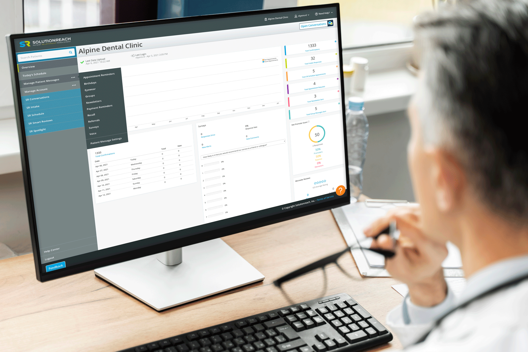
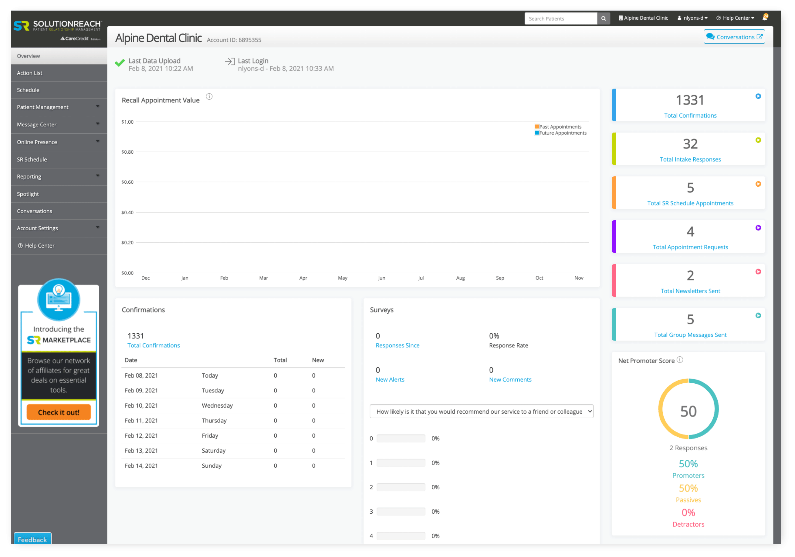
Outgrowing the Tool
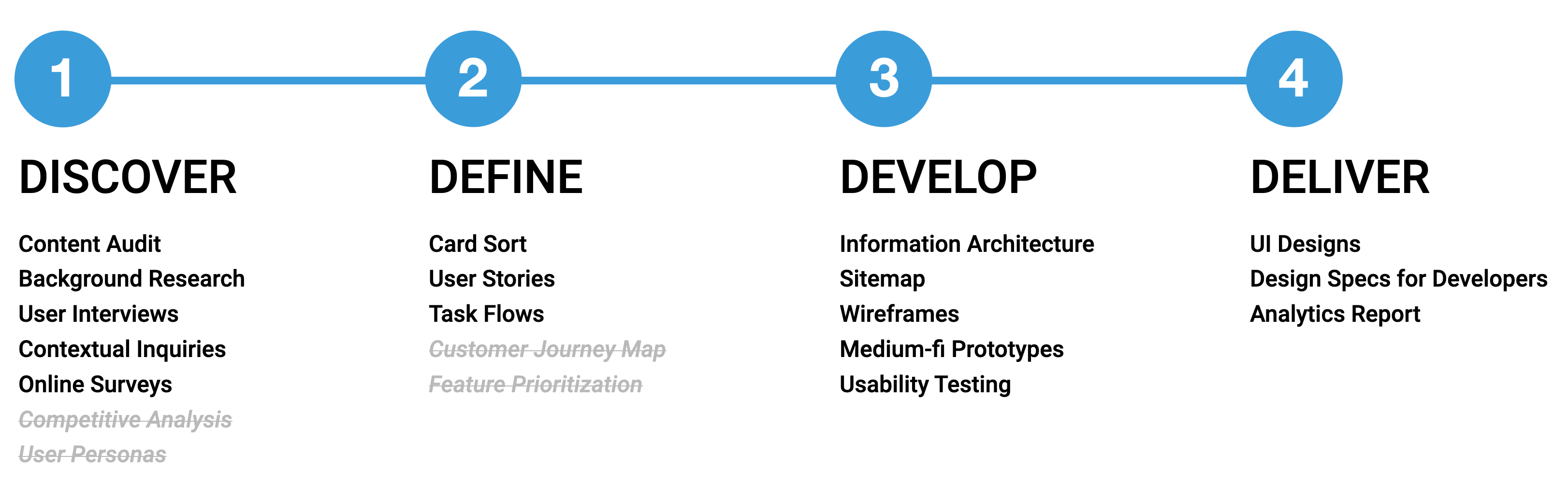
Research Plan & Design Process
Outlining the Approach
Following an initial discovery phase and audit of previous iterations, I developed a comprehensive research plan to guide the project over the following months.
User Insights
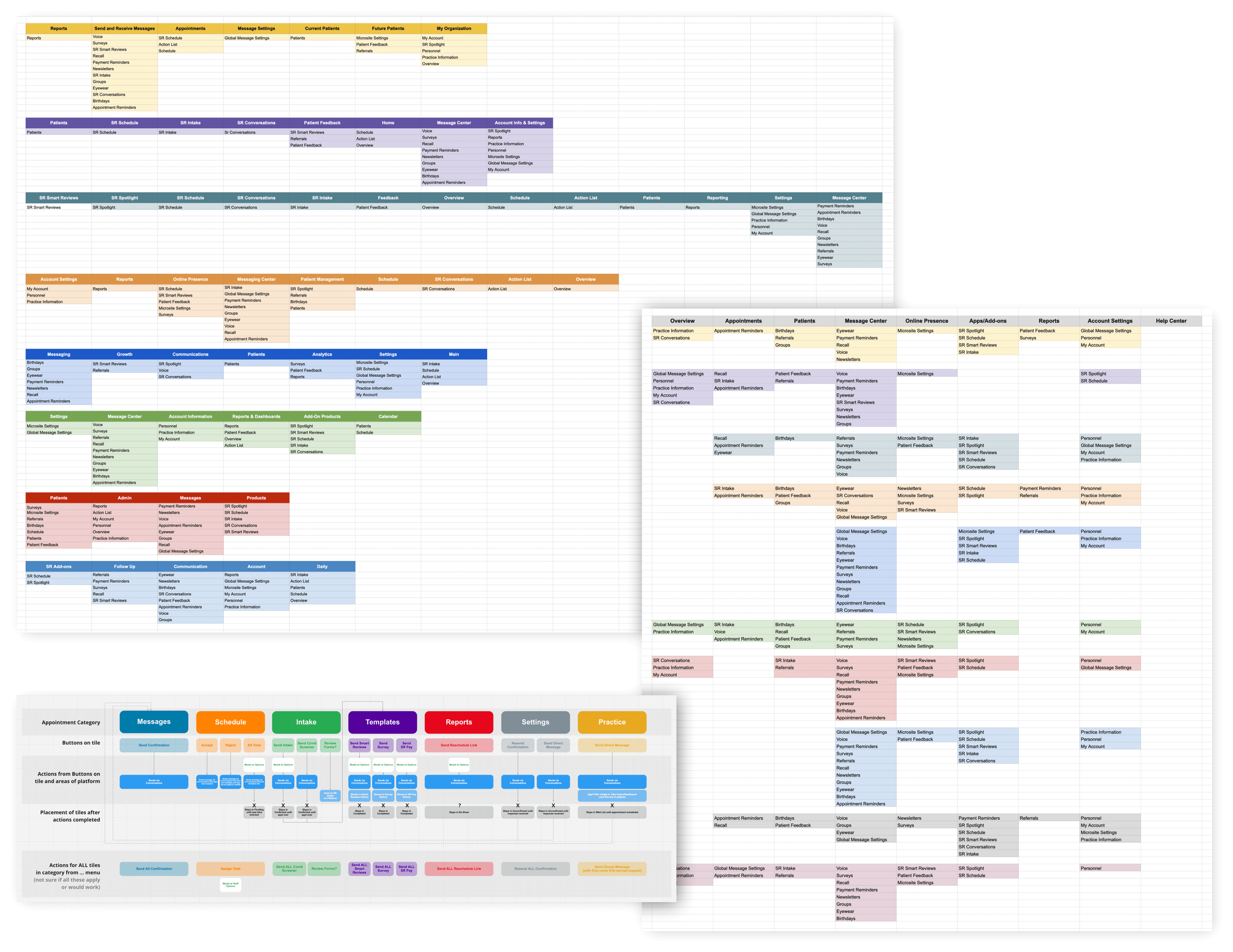
Redesigning the platform required a deep understanding of two core user groups: internal support teams and external customers. Interviews, card-sorting exercises, and task analysis were conducted for both.
Internal Service & Support teams – As power users, these teams were highly familiar with the product’s intended workflows and used it daily.Needs: Decrease customer support call volume while seamlessly adopting product updates themselves.
External customers – These users, typically medical practice staff, engaged with the platform less frequently, with workflows that varied depending on their role and subscribed features.Needs: Improve efficiency and reduce cognitive friction, enabling users to easily reorient after time away from the tool.
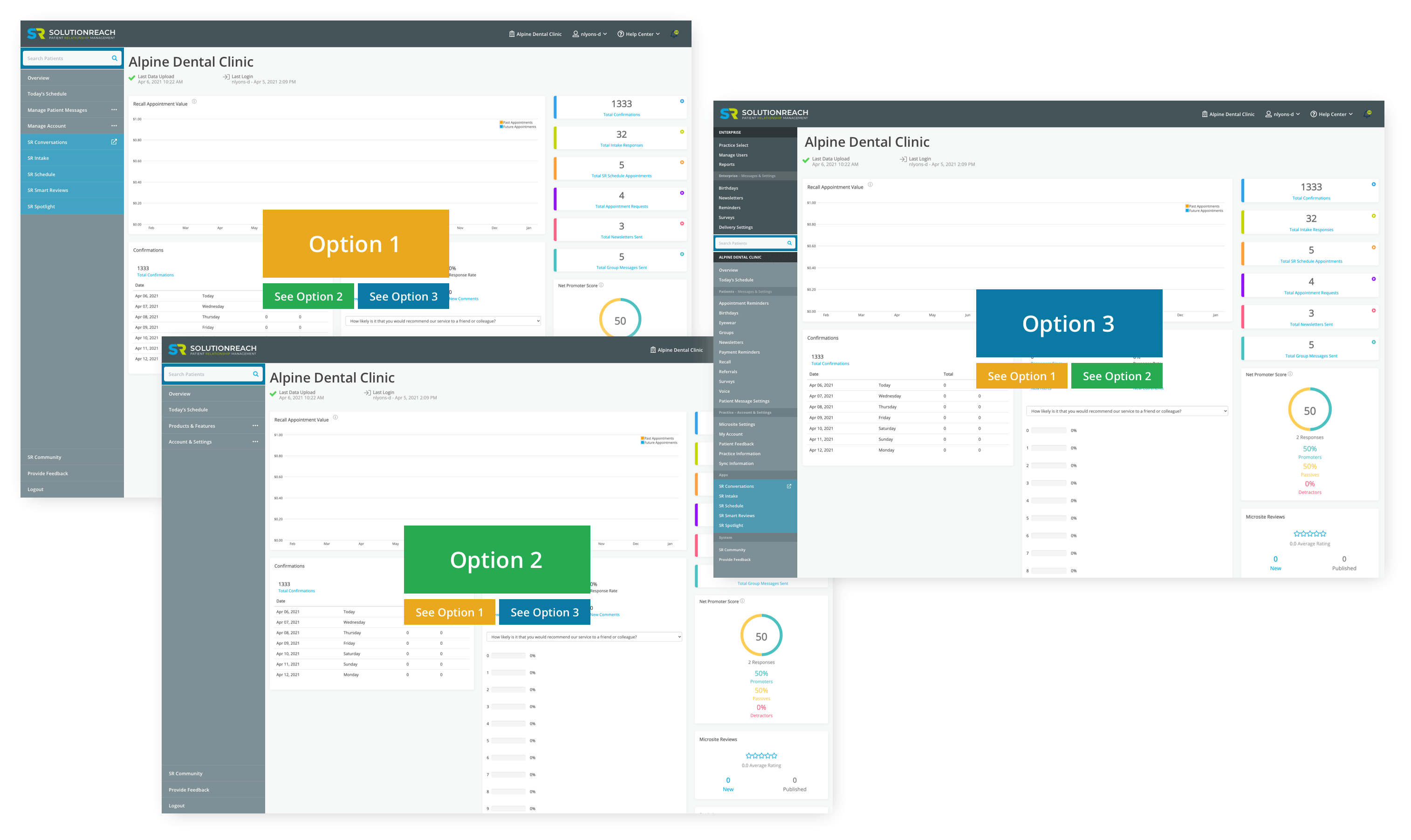
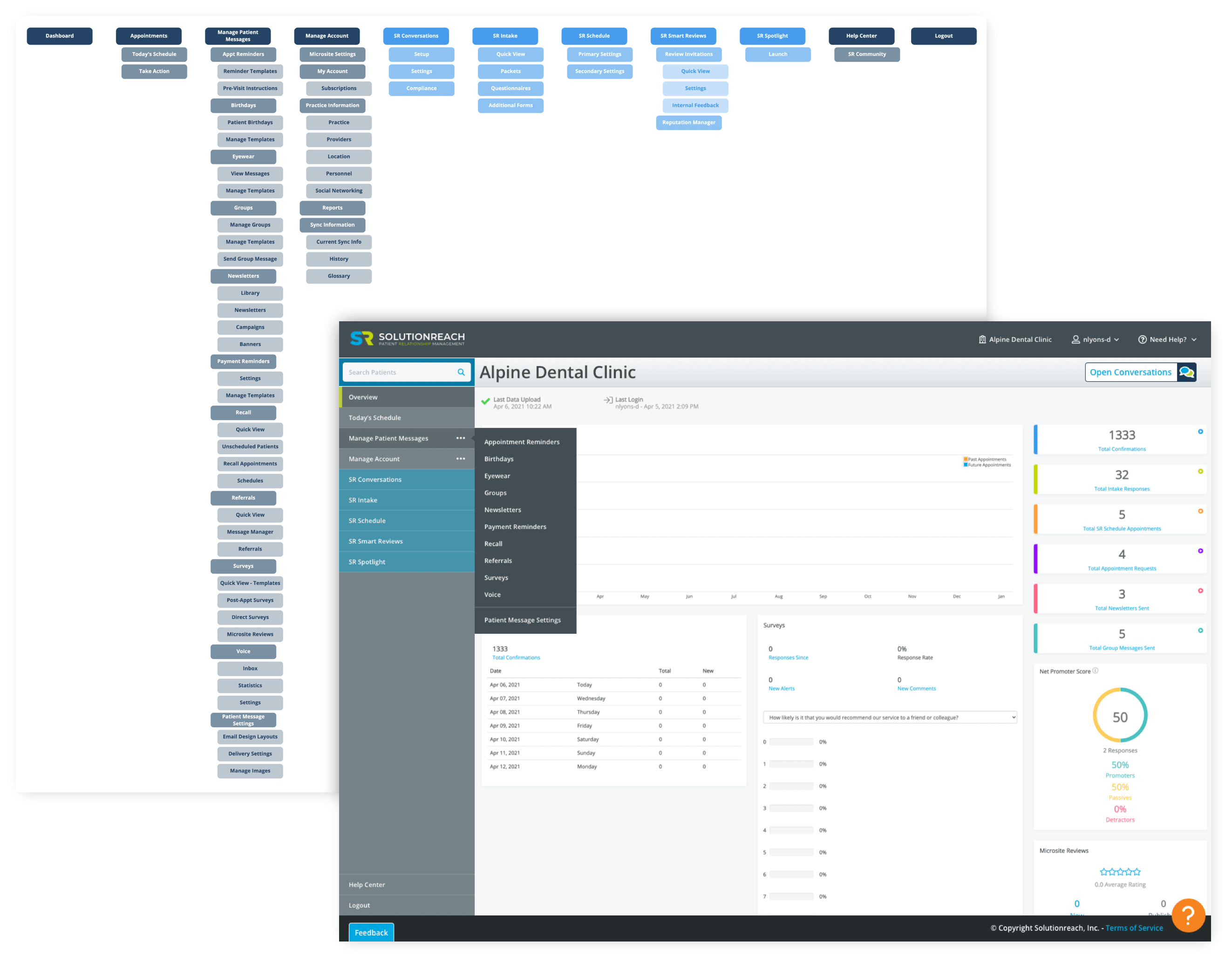
Develop & Ideate
While card-sorting exercises offered valuable insights, results across the two user groups were inconsistent and often contradictory. However, one clear priority emerged: the need to highlight each practice’s subscribed products.
Several rounds of medium-fidelity wireframes were created and tested with the original user groups.
Initial usability testing revealed:
- A 15% reduction in task completion time
- Positive feedback on product visibility and workflow clarity
- Criticism around excessive navigation tabs and unclear search placement
Based on this feedback, new iterations were developed and retested with users.
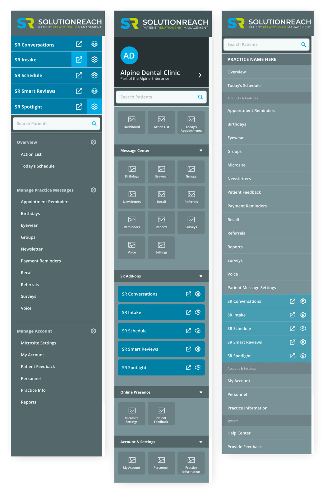
The Solution
- After months of research, design, and testing, we landed on a nested tab navigation structure that met the needs of both user groups.
- Internal teams reported that updating training materials was easier than expected, and saw an 18% drop in customer support calls in the first month after launch.
- External users appreciated the cleaner interface, clear access to subscribed tools, and more intuitive workflows—ultimately leading to increased productivity and improved patient care.
UI/UX
SR Information Architecture
My Contributions
I led the UX strategy, research, and end-to-end design of a restructured navigation system for Solutionreach’s core platform. I conducted stakeholder interviews, facilitated user research with internal and external audiences, and created wireframes and prototypes for testing. I iterated on designs based on usability insights, resulting in a more efficient and user-centered experience that reduced support calls and improved workflow efficiency.
Role
Senior UX Designer, Solutionreach, Inc.
2020-2023
Remote
Services
IA, Sitemaps, Wireframes, UI Designs, Custom Software Solution
The Challenge
About Solutionreach
Solutionreach, Inc. is a communications and technology company specializing in B2B software for medical, dental, and vision practices worldwide. Its portfolio of products enables practices to easily communicate with patients and manage essential tasks such as digital forms, scheduling, billing, and reviews.
Outgrowing the Tool
Research Plan & Design Process
Outlining the Approach
Following an initial discovery phase and audit of previous iterations, I developed a comprehensive research plan to guide the project over the following months.
User Insights
Redesigning the platform required a deep understanding of two core user groups: internal support teams and external customers. Interviews, card-sorting exercises, and task analysis were conducted for both.
Internal Service & Support teams – As power users, these teams were highly familiar with the product’s intended workflows and used it daily.Needs: Decrease customer support call volume while seamlessly adopting product updates themselves.
External customers – These users, typically medical practice staff, engaged with the platform less frequently, with workflows that varied depending on their role and subscribed features.Needs: Improve efficiency and reduce cognitive friction, enabling users to easily reorient after time away from the tool.
Develop & Ideate
While card-sorting exercises offered valuable insights, results across the two user groups were inconsistent and often contradictory. However, one clear priority emerged: the need to highlight each practice’s subscribed products.
Several rounds of medium-fidelity wireframes were created and tested with the original user groups.
Initial usability testing revealed:
- A 15% reduction in task completion time
- Positive feedback on product visibility and workflow clarity
- Criticism around excessive navigation tabs and unclear search placement
Based on this feedback, new iterations were developed and retested with users.
The Solution
After months of research, design, and testing, we landed on a nested tab navigation structure that met the needs of both user groups.
- Internal teams reported that updating training materials was easier than expected, and saw an 18% drop in customer support calls in the first month after launch.
- External users appreciated the cleaner interface, clear access to subscribed tools, and more intuitive workflows—ultimately leading to increased productivity and improved patient care.