


UI/UX
Queen VEcom Site
My Contributions
I led a comprehensive design audit to identify and resolve key usability and accessibility issues across Queen V’s ecommerce site. I developed a scalable design system, modernized UI components, and introduced consistent styling across pages. Collaborating with product managers and analysts, I redesigned high-impact product pages and improved the overall shopping experience across responsive layouts.
Role
UI/UX Designer, Brandable, Inc.
2019-2020
Beverly Hills, CA
Services
Wireframes, User Flows, UI Designs, Ecommerce Site on Shopify
Design Audit & Research
About Queen V
Queen V is a bold and empowering feminine wellness brand on a mission to reduce the stigma around vaginal health. Known for its cheeky tone and vibrant color palette, Queen V delivers high-quality products made from better-for-you ingredients that resonate with women of all ages.
The Challenge
My role was to audit and modernize the UI of Queen V’s revenue-driving and highest-visibility pages, specifically those with shoppable elements.
Key issues identified in the initial audit included:
- Contrast & Legibility – The site failed to meet basic accessibility guidelines for contrast ratios, type sizing, and font weight, making content difficult to read for many users.
- Styling & Consistency – There was a noticeable lack of visual and structural consistency across pages. Headers and body copy varied in size, placement, and HTML hierarchy.
- Missing Ecommerce Conventions – While the site had basic UI elements like buttons and form controls, it lacked essential ecommerce features such as product filters, a persistent cart, and star ratings.
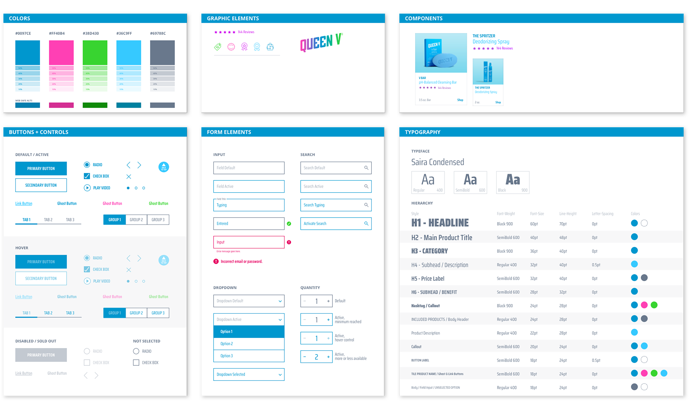
Building a Design System
As part of the initial audit, I began cataloging all existing and future UI elements that would need to be built as reusable components. One of the top priorities was reducing the number of type styles across the site to promote consistency and clarity.
Without disrupting the core identity of the Queen V brand, I introduced a more scalable UI approach and a fresh white page design. This included clear state styles for controls, a defined type hierarchy, and systematized spacing. Accessibility was also a key focus, so brand colors were adjusted for better contrast, controls were resized for easier touch targets, and minimum type sizes were established across breakpoints.
Design Iterations
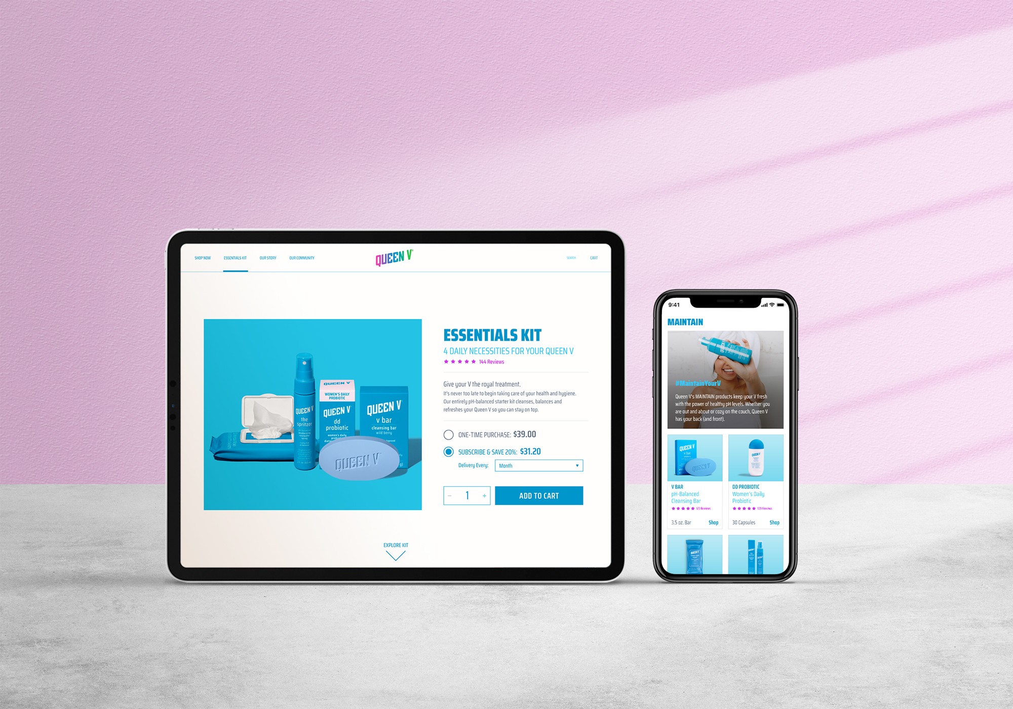
Essentials Kit Page
The Queen V Essentials Kit, being the top-selling and most profitable product, was the first to undergo a design and UX strategy overhaul. I started by creating medium-fidelity wireframes to help stakeholders visualize layout options and establish the hierarchy between the main kit and its bundled products.
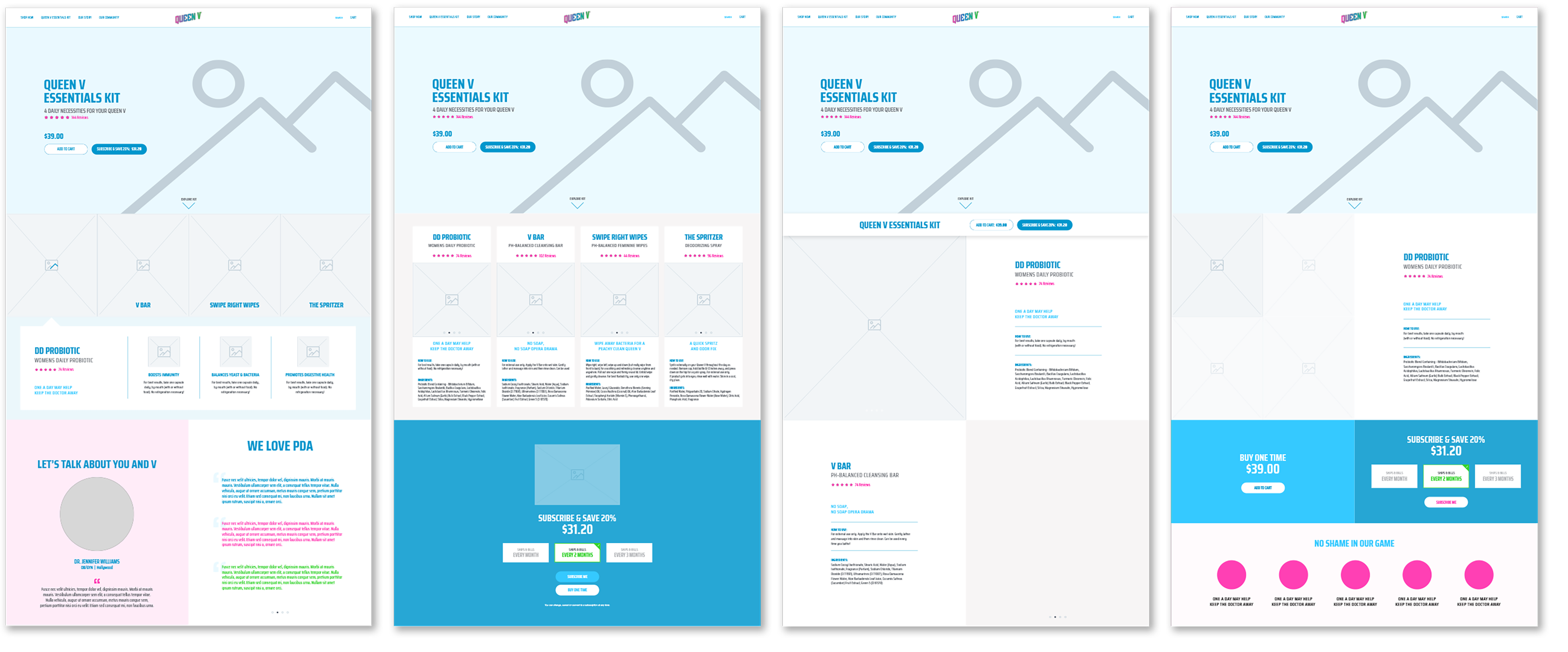
After collaborative reviews with developers and analysts, we aligned on a clear direction and I moved into high-fidelity mockups, including responsive layouts for both desktop and mobile.
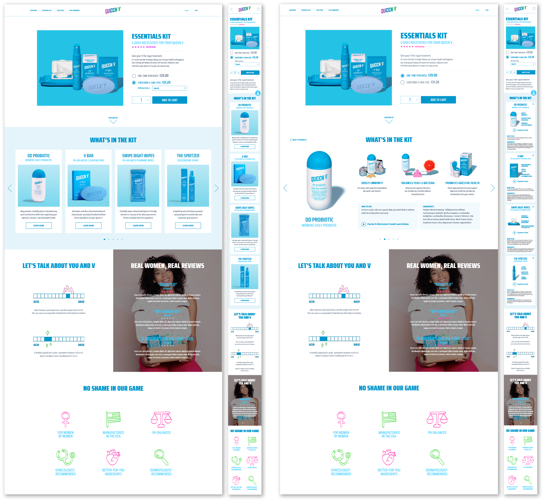
The new page was then finalized, handed off for development, and launched. To validate performance, we A/B tested the updated design against the original for one week. Within 24 hours of launch, we saw a 17% increase in conversions.
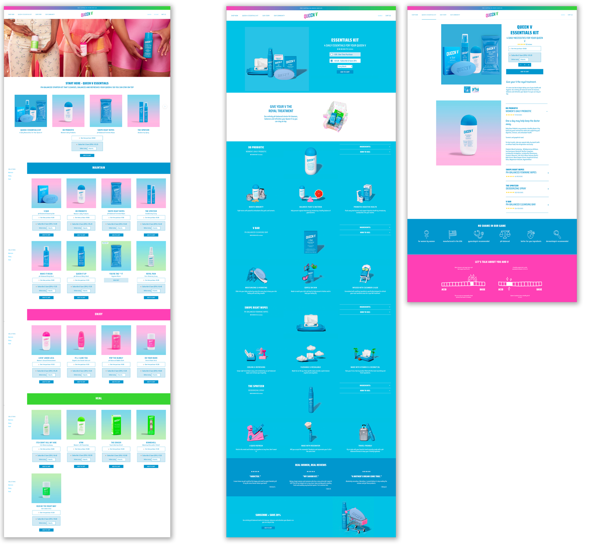
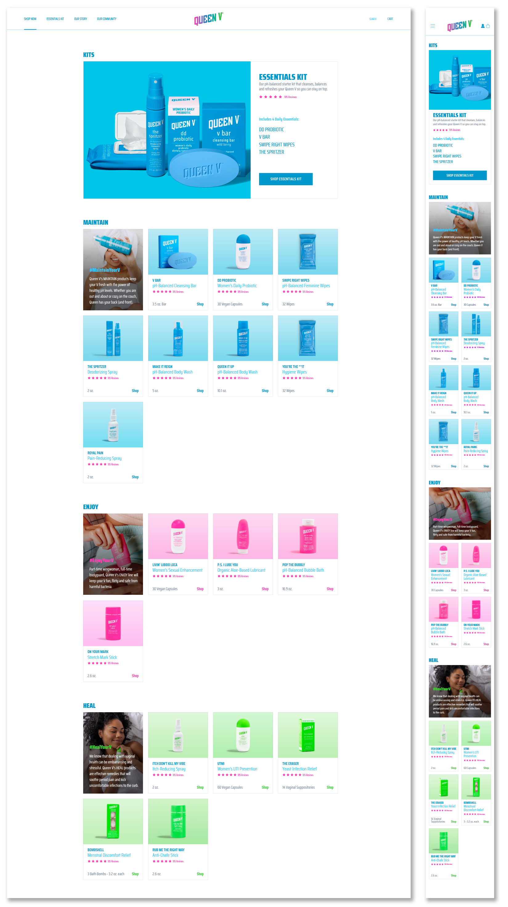
Shop Now Page
Next, I applied the same principles to the "Shop Now" page, a central inventory view of all Queen V products. The redesign prioritized clean product organization, updated filters, and modern shopping UI patterns. The page was approved, built, and launched within two weeks.
Post-launch metrics showed a 12% decrease in bounce rate and an 8% drop in abandoned carts within the first week.
The Solution
The final Queen V website featured responsive, high-performing pages with intuitive layouts and modern ecommerce best practices. The newly developed design system was implemented across all remaining pages, resulting in a consistent, accessible, and elevated digital experience that matched the brand’s bold personality while improving usability and conversion.
UI/UX
Queen V Ecommerce Site
My Contributions
I led a comprehensive design audit to identify and resolve key usability and accessibility issues across Queen V’s ecommerce site. I developed a scalable design system, modernized UI components, and introduced consistent styling across pages. Collaborating with product managers and analysts, I redesigned high-impact product pages and improved the overall shopping experience across responsive layouts.
Role
UI/UX Designer, Brandable, Inc.
2019-2020
Beverly Hills, CA
Services
Wireframes, User Flows, UI Designs, Ecommerce Site on Shopify
Design Audit & Research
About Queen V
Queen V is a bold and empowering feminine wellness brand on a mission to reduce the stigma around vaginal health. Known for its cheeky tone and vibrant color palette, Queen V delivers high-quality products made from better-for-you ingredients that resonate with women of all ages.
The Challenge
My role was to audit and modernize the UI of Queen V’s revenue-driving and highest-visibility pages, specifically those with shoppable elements.
Key issues identified in the initial audit included:
- Contrast & Legibility – The site failed to meet basic accessibility guidelines for contrast ratios, type sizing, and font weight, making content difficult to read for many users.
- Styling & Consistency – There was a noticeable lack of visual and structural consistency across pages. Headers and body copy varied in size, placement, and HTML hierarchy.
- Missing Ecommerce Conventions – While the site had basic UI elements like buttons and form controls, it lacked essential ecommerce features such as product filters, a persistent cart, and star ratings.
Building a Design System
As part of the initial audit, I began cataloging all existing and future UI elements that would need to be built as reusable components. One of the top priorities was reducing the number of type styles across the site to promote consistency and clarity.
Without disrupting the core identity of the Queen V brand, I introduced a more scalable UI approach and a fresh white page design. This included clear state styles for controls, a defined type hierarchy, and systematized spacing. Accessibility was also a key focus, so brand colors were adjusted for better contrast, controls were resized for easier touch targets, and minimum type sizes were established across breakpoints.
Design Iterations
Essentials Kit Page
The Queen V Essentials Kit, being the top-selling and most profitable product, was the first to undergo a design and UX strategy overhaul. I started by creating medium-fidelity wireframes to help stakeholders visualize layout options and establish the hierarchy between the main kit and its bundled products.
After collaborative reviews with developers and analysts, we aligned on a clear direction and I moved into high-fidelity mockups, including responsive layouts for both desktop and mobile.
The new page was then finalized, handed off for development, and launched. To validate performance, we A/B tested the updated design against the original for one week. Within 24 hours of launch, we saw a 17% increase in conversions.
Shop Now Page
Next, I applied the same principles to the "Shop Now" page, a central inventory view of all Queen V products. The redesign prioritized clean product organization, updated filters, and modern shopping UI patterns. The page was approved, built, and launched within two weeks.
Post-launch metrics showed a 12% decrease in bounce rate and an 8% drop in abandoned carts within the first week.
The Solution
The final Queen V website featured responsive, high-performing pages with intuitive layouts and modern ecommerce best practices. The newly developed design system was implemented across all remaining pages, resulting in a consistent, accessible, and elevated digital experience that matched the brand’s bold personality while improving usability and conversion.