
UX/UI Designer
Responsive E-commerce Website
2019
Sketch, InVision
Skylight Books is an independent bookstore in the Silver Lake neighborhood of Los Angeles. The store boasts a loyal following of avid readers and graphic novel enthusiasts, and often engages the community with in-store events that promote local artists.
When visiting their website, it’s easy to spot some immediate problems: it’s outdated, unresponsive, and full of different fonts and styles. Beyond those issues, the project brief I received asked that I closely examine and analyze its checkout process. Through this case study, I'll explain my approach to research and my exploration for a solution, although the steps outlined may not be in sequential order.
I was able to leverage my background in web design and branding to determine a more efficient IA and page styling to provide an improved user experience.
As someone who has designed and redesigned websites for clients in the past, I had extensive knowledge about how websites work. I did not, however, have a ton of e-commerce experience.
Before conducting any research specific to Skylight Books, I first need to get some general context about
e-commerce from users.
I found three users to interview and determined the key questions that I wanted to ask:
What experience did they have shopping for items online?
What were their shopping habits and routines when doing so?
What features did they prefer and expect during these experiences?
How did those online experiences differ if they were shopping for books specifically?
Not surprisingly, users I interviewed had experience with Amazon Prime accounts and were therefore familiar with the conventions of shopping for books and other goods online. This revealed what users expect when shopping online:
Recommendation listings
Filtered and faceted search features
Ratings and reviews
Alternate views and thumbnails
Easy-pay options
Checkout as guest feature


Being a designer, it's presumed that I would have some initial impressions about this website at first glance. Although I would explore those further in future steps, I wanted to see what other users thought about Skylight's site first.
I asked my users to complete a simpIe task: to find an in-stock, mystery book for less than $16 and add it to their carts. Most were unable to complete the task in under seven minutes. Users found the site hard to navigate and the process confusing. Without finding category listings, users entered Mystery in the search bar resulting in thousands of books, or selected Best Sellers but were confused by their hand-drawn covers.
When users finally made it to the cart and attempted checking out, they faced several new challenges:
A long and daunting checkout form
No error messages when inputting incorrect personal information
No Continue as Guest or PayPal options
The button to calculate shipping charges was placed above the shipping options
After completing three interviews, I sorted the results using affinity and empathy mapping. While some obvious trends arose – like the amount of users who prefer to do their online shopping via their mobile device – a few surprising insights were also uncovered.

When searching for books, I was surprised to learn:
How important it was that users be shown ratings and reviews
How users often make decisions based on what’s recommended to them or by browsing similar listings
How important it was for users to find cost-saving opportunities with used vs. new books
When checking out, I didn't realize:
How much users preferred using PayPal as their payment method
How much users dislike creating accounts for every site they shop
How much users valued free shipping or other cost-savings methods like in-store pickup when available
After speaking with users and combining that with my own experiences of shopping online, one thing was becoming clear about Skylight's site:
Without the e-commerce conventions buyers were used to, they would have a bad shopping experience.
The next part of my process had me evaluating the site for myself. I had ideas about how a bookstore’s online experience should be structured, but I needed to figure out what was actually wrong with this site and what areas could I improve on. I conducted a heuristics evaluation and determined most of the violations found on Skylight’s site included learnability, efficiency and memorability.

Comparing Skylight's site was happening in conjunction with analyzing the heuristics. In conducting a C&C analysis among competitive sites, I found that most features present on other sites, including shopping cart, book details, and ratings, were missing on Skylight’s, making it difficult to search for books and checkout.

I wondered if Skylight's artistic aesthetic and highlighting their in-store events was a bigger priority for them than allowing users to easily buy books online? And if so, how likely would that affect users from repeat visits to the site?
Why couldn't the site function better for users while maintaining the store's character?
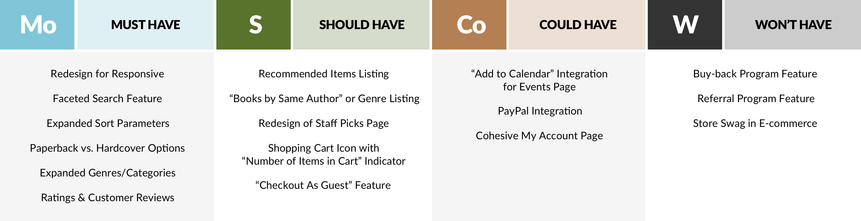
Identifying what features were missing that led to bad user experiences, made it easy for me to determine what features I would need to incorporate. I outlined them here in a feature prioritization.
Next, I analyzed the information architecture and determined which areas would benefit most from a reorganization. Because Skylight's web content was so unique to their store and confusing to outside users,
I determined that an effective IA might come from incorporating common categories and genres that other bookstores feature and users have familiarity with. This theory would be tested in later prototypes.
Redistributing some of the site's information, to create visual order to the content would be my next step. I moved the site's contact info from a floating side tab to a global footer, and pulled My Account and Shopping Cart out of the second row of navigation. I thought that Shop might be a better navigation option than Books, which would give sidebar callouts like Gift Cards and Memberships a more appropriate home.

In order to determine if this sitemap would efficiently lead users to achieving their goal, I created a new flow taking the user from home page exploration to the checkout process.

Although a few new steps were added, this flow ensures the user can easily move through the site, find what they're looking for, and avoid errors.
With initial ideas in mind about how to improve users' first impressions, I began sketching layouts for a more intuitive home page. I drew several options for the navigation, promotional slider, and other page features including faceted navigation and recommended lists.

Not wanting to completely overhaul the store's brand or personality, I visited Skylight Books and gained some inspiration from inside the store. While the website reflects a bohemian style, the in-store experience was straightforward, thoughtfully organized, and quite charming. I noticed an awesome tree located at the center of the store, growing up towards a set of SKYLIGHTS. With this inspiration in mind, I used the brown of the tree trunk and wooden bookshelves, the green of the leaves, and blue of the sky to develop my site’s design style.

By using the colors I found in-store and casual typography, I could achieve an updated visual design that felt authentic to the store and its customers.
With a visual design scheme locked in, I moved to finalizing a site layout next. I went back to my original sketches, and expanded on them to create plans for interior pages, a mega menu, and the checkout process. I broke the cart experience up into four digestible stages in hopes of eliminating user confusion and errors. I performed three usability tests with lo-fi paper prototypes, to understand if this design worked for users.

Insights revealed by these tests include:
Provided clarity on Homepage – I tested three variations on users, they all preferred the simplest design
Wait to resolve shipping costs in checkout process instead of estimating that in earlier stages
Product Details page needs Back button
Consider implementing Save Customer Information feature after completing transaction
I considered the feedback provided by users and made the revisions to my designs with increased fidelity. I added titles, descriptive copy, and more information to help users make informed decisions while moving to the checkout process through a clickable prototype. I tested two more users on these layouts.

Insights revealed by these tests include:
Changing quantity wasn’t possible until checkout process
Placement and styling of In-store Availability was confusing – user thought it wasn’t available for pick-up
This redesign concept is an intuitive, albeit more robust, update to their existing website. Now fully-responsive, Skylight's website includes expanded search capabilities, helpful discovery features, a PayPal option for easy checkout, and improves user efficiency for buying books online.
7 minutes reduced to 90 seconds in task completion.
7 minutes reduced to 90 seconds in task completion.
My nexts steps include extended features in the checkout process and building out the remaining pages.
Implement one-click checkout utilizing stored user payment info
Consider Save My Information at checkout
Build out Events page with Add to Calendar integration for upcoming events


