
UX/UI Designer
Responsive Web
2019
Figma
Contributing Members
Erin Smith
Harel Fedida
My Contributions
3 User Interviews & Empathy Map
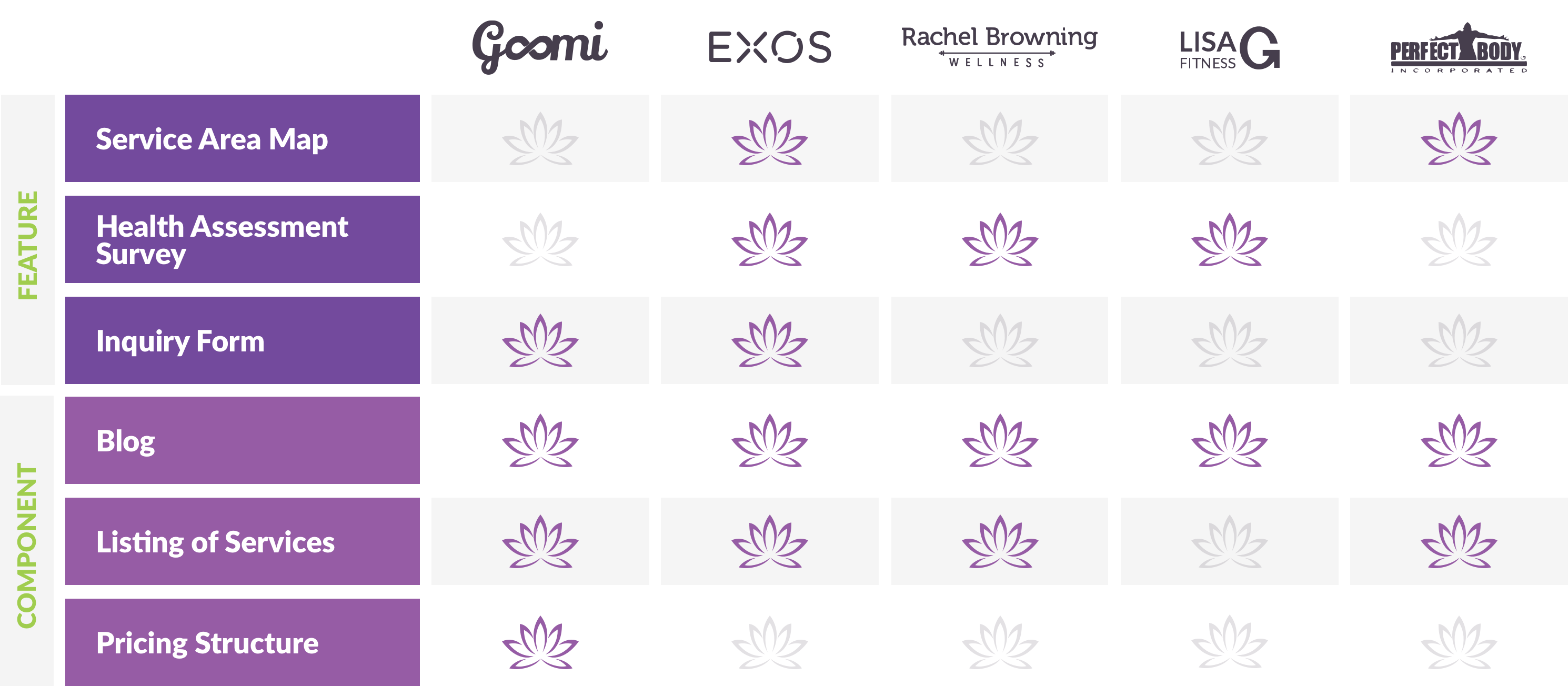
Competitive Analysis
Information Architecture & User Flows
Feature Prioritization
High Fidelity Design
Prana Wellness is a company founded by Yoga, Spin, and Pilates instructor Stephanie Erazo. After leaving the corporate world to begin her own journey of mindfulness, she quickly realized that companies often didn’t take into consideration their employees mental well-being. Once, after experiencing a panic attack while on the job, she became determined to focus her efforts on helping others in a similar situation find peace, stress relief, and a mindful escape, both while at work and after hours. The problem was, she didn’t know where to start.
My group and I were tasked with developing the most effective product to not only help her target corporate clients, but also grow her business, and engage individual users in her wellness programming.
I leverage my experience in branding, content strategy, and my time in corporate environments to determine a valuable marketing product for this growing company.
In first meeting the client, she explained her business idea – to bring wellness programs to corporate environments. She explained her background and why this business model was important to her, and how she's been operating to date: mostly by word of mouth and with no formal branding to speak of. She also mentioned wanting an app for her new business.
I needed to get more context as to why she thought an app was the best solution to start with, so I brought up the following considerations:
Exposure, outreach, and marketing – With an already saturated market of fitness apps available to mobile users, I thought it might be challenging to make an impact in that space and hard for new users to find her app.
Corporate devices and limitations – I knew, based on my own experiences in corporate settings, that some companies lock users out of downloading certain apps or restrict the content they can view on their company device. I thought this might block potential clients from using her services or limit access to her information.
Expense to develop and user costs – Not knowing how much she was looking to spend, I advised that the cost to develop and maintain an app is often far more than that of a website. Additional expenses would come when launching via the App Store and hosting web services based on the complexity of the app.
To put a positive spin on the conversation, I assured her there were other solutions to her business's first product – like a robust website.
I identified the opportunities for building a website first, and then possibly expanding to an app later:
Responsiveness – Responsive websites open up the possibilities for ALL users to find and interact with the company's content, regardless of device they're on or where they're viewing the site, and typically don't incur upfront user costs.
Lead Capture and Tracking – With robust online tracking services like Google Analytics, she easily could monitor her site's activity and make fast changes to the content based on page performance and user engagement. Other outreach efforts like email and digital marketing, and social media could also be integrated.
Features – Some of the key components that she was hoping an app could provide were still possible on a website: notifications, calendar and scheduling, streaming videos, user accounts, and live chat could all be built.
I determined that a responsive website would provide a positive user experience, while appealing to the widest audience as the business expands.
Before planning began on what this website would feature, do for the user, and look like, a bit of context was needed on today's wellness market and the competitive landscape. I needed to understand what others were doing in the space and how our client would compete. I focused on finding competitive wellness providers that had some aspect of corporate wellness as a service and conducted a C&C analysis.
Hearing from users about their experiences with mindfull practices and determining what users look for in a provider was key. Based on my experience attending wellness fairs through previous employers, I knew HR professionals would provide good insight, as they are typically in charge of implementing that programming for employees. But who else, and what did we seek to gain from our interviews? We determined the following approach would work best:
HR professionals – How did they find their providers and what was their criteria?
Employees – What was their experience with workplace wellness programs and what could be improved?
General fitness users – How did they engage in wellness programs?
Users referred by the client – What was their experience like with Prana and what could we capitalize on for promoting this new business?
After interviewing 12 users and affinity mapping the results, these key insights were revealed:
Most HR managers utilized their company’s insurance broker to find wellness providers or services
Most employees now expect their employer to implement some sort of wellness programming
Price, convenience, and schedule were the biggest factors when deciding what classes to take

I concluded that this website would need to address a variety of issues for more than one user set or objective in mind.
In identifying who exactly this website would be useful for, the following demographics and considerations were addressed and the two personas below were the result.
For the employer:

How might we help users find and inquire about custom solutions, share Prana's services, and also engage in their own wellness?
Determining the most valuable features came with some cross over and some features that would help each user set in achieving their goals. Of the most notable and specific, was a robust custom-quote form for HR professionals and a referral form for individuals. I used the MoSCoW method to outline potential features:

The sitemap below outlines sections specific to each user set, but also offers pages with equally valuable information and interactive opportunities. New users coming to this site will have several options to engage in their own wellness, regardless of their employer's wellness program or personal goals.

I began my design exploration by addressing the Home, Corporate Wellness, and Personal Wellness pages and the key features I wanted to include on each of those: the custom quote and referral forms. I also thought it was important to include wellness benefits, listing of services, images of past programs, testimonials and pricing plans for wellness subscriptions.

While the client didn’t yet have a brand established, she did share a beta site and color scheme that she had developed through some free online services, but not yet launched. My final direction was a sophisticated lotus mark, clean typography and peaceful, fresh colors. For the photography, I sourced a mix of client images from past yoga events, as well as stock photography to supplement the at-work imagery.

With corporate clients in mind, I determined the site's design scheme would need to be a polished and professional take on a tranquil subject matter.
With the IA in order, the user flows were developed next, getting each persona quickly to their destination and easily achieving their goals.
The corporate flow allows users to:
Browse a list of benefits and services specific to corporate wellness
Explore pricing options for wellness programs and events
Fill out a quote and request custom pricing based on the company's unique needs
The individual flow allows users to:
Find information about maintaining personal wellness and subscription plans
Explore maintenance tips for at-work wellness, watch workout videos, and access premium content
Refer Prana Wellness to their employer via a custom email form with sales decks and HR tools attached

If this site was going to be effective, it had to make sense to users, beyond what was planned on paper. Creating a clickable prototype and testing both low and medium fidelity on users would be key in determining if the site was straightforward and the content was arranged appropriately.

Insights revealed through eight usability tests:
Users were not scrolling to the bottom of each page – consider placing important information at top
Users were overwhelmed with the amount of information – consider what content can be reduced or cut and using carousels for quick callouts
Users were confused about some CTA language – make actionable content clear and concise
This website allows employers to quickly qualify if Prana’s services are the best fit for their company and allows individual users to refer Prana’s services to their employers while engaging in useful yoga, meditation and breathing exercises on their own. New users of all types will also benefit from the wellness information and can easily incorporate mindfulness into their lives on a daily basis.
This fully-responsive site enables a variety of users to learn more about wellness programs and engage in mindful activities whether at home or at work.
The next steps for the website address further engaging personal wellness users and assumes that the corporate wellness client roster has grown considerably. The website shown here is currently in development.
Implement Live Chat feature
Implement push notifications & reminders
Implement like & share functionality on workout content
Consider Class Schedule & Event Calendar features
Consider Shop for branded merchandise


